node-red-contrib-ui-iro-color-picker 0.1.6
iro.js color picker for the Node-RED dashboard
node-red-contrib-ui-iro-color-picker
Color picker node utilizing the iro.js widget.
The node-red node is highly customizable inside the editor by choosing and combining several components either as a widget or a popup window.
For latest Updates see the change log in the end of this document. For color conversion the node-red-contrib-chroma node is a good companion.
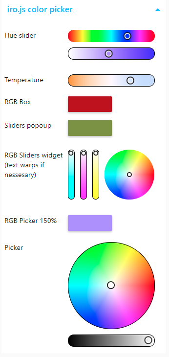
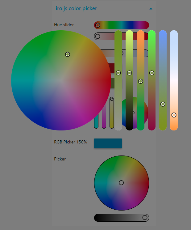
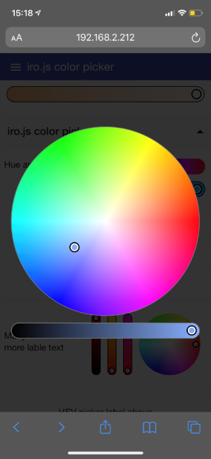
screenshots
Install
Either use the Editor - Menu - Manage Palette - Install option, or run the following command in your Node-RED user directory (typically ~/.node-red) after installing Node-RED-dashboard.
npm i node-red-contrib-ui-iro-color-picker
Examples
Examples can be imported via import/examples in the top right menu of the editor
mixed widgets(all auto size)vertical sliders(custom size, label above the widget)compact buttons(modal popups custom button size in a compact layout)tuneable white(special feature for tunable LEDs)
Inputs
Send msg.payload to this node to change the color of the color picker widget. The format can be any of the color formats iro.js supports
- Hex string: "#ff0000"
- Hex alpha string: "#ff0000ff"
- Shorthand hex string: "#f00"
- Shorthand hex alpha string: "#f00f"
- RGB string: "rgb(255, 0, 0)"
- RGBA string: "rgba(255, 0, 0, 1)"
- Percentage RGB string: "rgb(100%, 0%, 0%)"
- Percentage RGBA string: "rgba(100%, 0%, 0%, 100%)"
- RGB object: {r: 255, g: 0, b: 0}
- RGBA object: {r: 255, g: 0, b: 0, a: 1}
- HSL string: "hsl(360, 50%, 100%)"
- HSLA string: "hsla(360, 50%, 100%, 1)"
- HSL object: {h: 360, s: 50, l: 100}
- HSLA object: {h: 360, s: 50, l: 100, a: 1}
- HSV object: {h: 360, s: 100, v: 50}
- HSVA object: {h: 360, s: 100, v: 50, a: 1} and
- Tuneable white
{v:100,t:6000}see output - RGBW object:
{r:255,g:255,b:255,w:255}see output - HSI object:
{h:360,s:100,i:100}see output
in addition the following numeric input formats are supported to set individual parameters
msg.hue0 - 360msg.value0 - 100msg.saturation0 - 100msg.red0 - 255msg.yellow0 - 255msg.blue0 - 255msg.alpha0 - 1msg.kelvin2.000 - 40.0000
if a numeric msg.payload is received it is assumed that the value corresponds to the output format. In this case the output format has to be set to a single value format!
Send msg.enable false to disable the widget.
Outputs
Node will send the color value as msg.payload. The format can be one of the input formats.
The supported formats of iro.js are expanded by 3 formats, especially to handle RGB(W) LEDs:
Tuneable white
{v:100,t:6000}experimental featureAs iro.js does not support tuneable white with variable value (i.e. tunable LEDs). Linking value and temperature sliders together the color temperature only effects the RGB model. Two slider instances will be created. The input and output will be linked. Iro.js don't allow value changes on the temperature slider! See issue on github for details
If tunable white is selected as output The Input can be
msg.value,msg.kelvinor{v:100,t:6000}.Please select a value and kelvin picker ONLY
RGBW color object
{r:255,g:255,b:255,w:255}usable for RGBW LEDs experimental featureRGB LEDs are not capable to display unsaturated colors correctly as in light mixing white is missing as it is provided in subtractive color mixing by the paper. Mixing RGB 100% also don't give a nice white. So to get full spectrum lights RGBW Leds are often used. Important: make sure that if you send in a RGBW object the RGB part is full saturated. (one component, R, G or B is always 0)
HSI object:
{h:360,s:100,i:100}experimental featuresimplified intensity is calculated by avg(r,g,b) instead value=max(r,g,b) in hsv model. code is borrowed from chroma.js nice library for a future conrib-node
General configuration
- Size:
- in most cases the picker works best in auto mode. Custom sizes should be considered when using vertical sliders or popup modal sliders with smaller button size.
- Label:
- a text string to show on the left
- an indent for the widget to align the widget nicely (as grid units)
- placement the label can be placed on the left or above the widget or button.
- Align the label can be aligned horizontally (left, center or right) and vertically (top, middle, bottom)
- initial color
- an initial color can be specified
- Type:
The picker can showup as a widget or a popup window
- as widget
- as widget the picker will be placed in the remaining space left or under the label. Depending of the selected components the widget will take the necessary height or scaled to fit.
- as popup
- popup center button centered to the button position
- popup center group centered to the group
- popup center window centered in the browser window
- widget width can be scaled relative to the group
- button sized in grids
- the background color and alpha can be specified
- the background can follow the picked color
- as widget
- bypass messages select this to pass all incoming messages to the output
- send
- when released send a message when the user release the mouse button
- on user interaction send on every user interaction
- the output can be limited either by a maximum frequency or dynamically
- if when confirmed is checked new messages are blocked until the last message is confirmed by the backend. This should adopt the updates according to the backend speed and the network. A minimum frequency can be specified to avoid a block if a messages was not confirmed or not detected as confirmed.
- if unchecked a maximum update frequency in messages per second can be defined.
- payload choose the desired output format.
- topic topic to be added to the message
- name name of the node inside the editor
Component configuration
iro.js offers a variety of different color picker styles. These can be combined as required showing a part of the color definition
- stacking the components can be arranged either vertically (on above the next) or horizontally (one beside the next)
- components a combination out of several components can be selected and sorted.
- Each component has these general options
- border color
- width border width in pixel. 0 or none to disable
- color wheel: The classic color wheel showing the hue. (Should be combined with a saturation slider)
- lightness fade to fade the wheel according to the lightness level constant to show full colors only
- starting angle of 0° hue level
- direction of the color wheel to be drawn
- color box: Classic color box showing the saturation and lightness of a color. (Should be combined with a hue slider or wheel)
- the hight in pixel of the box can be specified. 0 or none for a square
- sliders several different sliders can be selected and combined
- hue
- saturation
- value (lightness)
- red
- green
- blue
- alpha (transparency)
- color temperature in ° Kelvin
- minimum value (>2.000°K)
- maximum value (<40.000°K)
- Each component has these general options
Changelog
0.1.6 bugfix
- fix for partial (color component) updates
0.1.5 bugfix
- fix for label taking space even if empty
0.1.4
- moved extra formats support to the backend to reduced frontend code size
0.1.3
- extra in- and output format for hsi color model
{h:360,s:100,i:100}experimental
0.1.2
- modal pop size can be defined in width and hight independent of widget size
- extra in- and output format for RGBW Leds
{r:255,g:255,b:255,w:255}experimental - fix label of box height
- fix for slider length of horizontal stacked sliders with custom size widget and no label.
0.1.1
- initial color can be changed until a valid color is received
- Editor Help window completed
- German localization of the config UI and help text
0.1.0
- fixes modal issue on iOS
- positioning and aligning of labels
- flexible button size
- fixed: scaling and positioning of widgets and popups
- support of tunable white (value and temperature)
- custom initial color
- several bugfixes
0.0.7
- partial fix for safari issue: Display seams OK but taps/clicks are still poking through
- single value payloads
- extra output format for tunable whites
{v:100,t:6000}experimental - fix for single hue slider (default color is set to red
{r:255,g:0,b:0}) - msg.topic defaults correctly
- hsl and hsla output fixed
- fixes for horizontal stacking
- fixes for widgets without a label
Requirements
- Node-RED v19.4 or greater
- Node-RED-dashboard v2.13.0 or greater