smithtek-3dm-scada-canvas 1.1.0
Smithtek 3DM SCADA Canvas for Node-RED with browser-based canvas editing and local SQLite history.
LICENCE: 3DM SCADA Canvas is licensed under the GNU GPLv3 — GNU General Public License version 3.
3DM SCADA Canvas
Node-RED User Manual
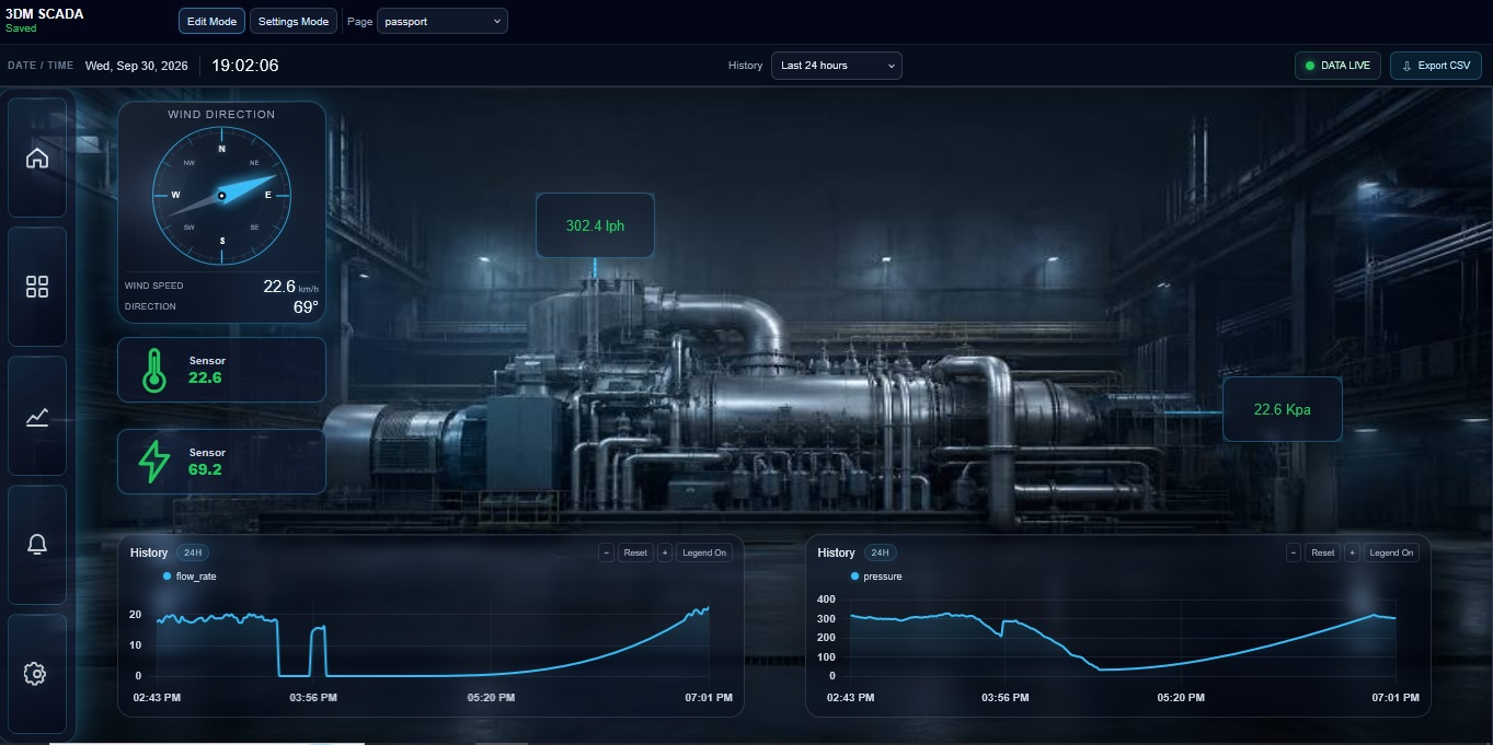
3DM SCADA Canvas is a locally hosted SCADA and HMI dashboard system designed to run directly from Node-RED.
It allows live telemetry to enter through a Node-RED input, displays that information on a graphical SCADA screen, stores historical information locally, and sends operator commands back into Node-RED through the node output.
The system can be used for applications including:
- Pumps
- Tanks
- Bores
- Water treatment
- Irrigation
- Process equipment
- Generators
- Remote telemetry
- Mining
- Utilities
- Industrial automation
- General monitoring and control
1. The SCADA Dashboard Node
The 3DM SCADA Canvas node is the main connection between Node-RED and the graphical SCADA dashboard.
In simple terms:
Live data enters the node
↓
The SCADA Canvas displays it
↓
The operator can view or control equipment
↓
Commands leave through the node output
The node has:
1 Input → 3DM SCADA Canvas → 1 Output
The input pin receives live telemetry.
The output pin sends commands generated by SCADA controls.
The SCADA interface itself runs in a normal web browser.
2. First-Time Dashboard Access
After placing a new 3DM SCADA Canvas node into Node-RED, click Deploy.
The node automatically creates a unique SCADA URL.
Look underneath the node after deployment.
You will see a status similar to:
3DM SCADA • /scada/scada-a1b2c3d4
The final section is automatically created from the Node-RED node ID so that multiple SCADA Canvas nodes can exist without using the same address.
Easy First-Time URL Helper
You do not need to type the entire address shown underneath the node.
Start with the normal address of the computer, PassPort or device running Node-RED.
Using a hostname
Copy:
http://your-hostname:1880/scada/scada
Then look underneath the SCADA node.
For example, if the node shows:
/scada/scada-a1b2c3d4
the unique part is:
-a1b2c3d4
Add that unique part to the end:
http://your-hostname:1880/scada/scada-a1b2c3d4
Open that finished address in your web browser.
That opens your SCADA page.
If Node-RED Is Running on the Same Computer
Start with:
http://127.0.0.1:1880/scada/scada
If the node shows:
-a1b2c3d4
the finished address is:
http://127.0.0.1:1880/scada/scada-a1b2c3d4
Important:
127.0.0.1means this computer. It only works when the browser and Node-RED are running on the same computer.
If Node-RED Is Running on a PassPort or Another Device
Use the IP address you normally use to access Node-RED.
For example:
http://192.168.1.100:1880
Start with:
http://192.168.1.100:1880/scada/scada
Then add the unique ending shown underneath the node:
-a1b2c3d4
Finished address:
http://192.168.1.100:1880/scada/scada-a1b2c3d4
Simple Rule
Your normal Node-RED address
+
/scada/scada
+
the unique -a1b2c3d4 part
=
your SCADA page
Once the SCADA has been opened for the first time, its URL name can be changed from Settings.
For example:
/scada/scada-a1b2c3d4
could later be changed to:
/scada/warburton
or:
/scada/pump-station
3. Dashboard URL
Each SCADA Canvas runs from its own web URL.
This means the SCADA screen does not need to remain open inside the Node-RED editor.
It can be opened directly in a browser.
Examples include:
http://127.0.0.1:1880/scada/warburton
http://192.168.1.100:1880/scada/pump-station
http://passport-hostname:1880/scada/main-site
The dashboard can therefore be accessed:
- Locally on the Node-RED computer
- Across a local network
- From another computer
- From a tablet
- From a control-room display
- Remotely when the Node-RED host has suitable secure network access
The SCADA Canvas does not automatically expose Node-RED to the public internet. Remote access still depends on how the Node-RED device and network are configured.
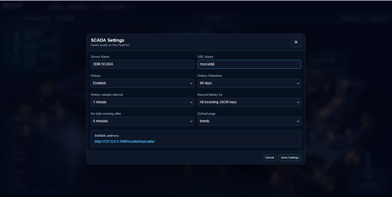
4. The Settings Page
The Settings page is the administrative area for the SCADA Canvas.
It controls settings that apply to the overall SCADA system rather than an individual widget.
Depending on the current Canvas configuration, settings include:
- SCADA Server Name
- SCADA URL Name
- Default Page
- History Enabled / Disabled
- History retention period
- History sampling interval
- History recording mode
- No Data Communications Timeout
- Global canvas preferences
- Canvas layout and sizing behaviour
- Grid and alignment behaviour
Grid controls are also available directly while building the screen in Edit Mode.
These include:
- Show Grid
- Snap to Grid
- Grid Size
Server Name
The Server Name is the name displayed by the SCADA interface.
Example:
Warburton Water Supply
or:
Main Pump Station
URL Name
The URL Name controls the final part of the browser address.
For example:
warburton
creates:
/scada/warburton
Use simple names containing letters, numbers and hyphens.
Default Page
The Default Page is the page that opens automatically when someone first opens the SCADA URL.
For example:
Overview
History
History can be enabled or disabled.
When enabled, incoming telemetry is stored locally so operators can view trends and export historical data.
The standard configuration uses local SQLite history through sql.js.
The default installation is configured for approximately:
Retention: 90 days
Sample interval: 10 seconds
These settings can be changed.
No Data Communications Timeout
This setting determines how long the SCADA will wait without receiving genuine new telemetry before declaring the data stream unavailable.
For example:
300 seconds = 5 minutes
The timeout should be selected to suit the normal telemetry update rate.
5. Edit Tab vs Live Tab
The SCADA Canvas has two very different operating modes.
Edit Mode
Edit Mode is for building the screen.
Use Edit Mode to:
- Add widgets
- Move widgets
- Resize widgets
- Position equipment
- Change colours
- Configure telemetry keys
- Configure labels
- Configure gauges
- Build tables
- Add pages
- Add navigation
- Add background graphics
- Add images
- Configure controls
- Configure widget appearance
Important
Control widgets are not intended to operate live machinery while you are arranging the screen in Edit Mode.
This prevents a user from accidentally operating equipment while trying to move, resize or select a widget.
Think of Edit Mode as:
BUILDING THE SCADA
Live Mode
Live Mode is the operating SCADA screen.
Use Live Mode when the dashboard is ready for normal operation.
In Live Mode:
- Telemetry is displayed live
- Controls become operational
- Navigation buttons work
- Trend interaction is enabled
- Operators can change pages
- Commands can be sent into Node-RED
- Historical data can be viewed
- Equipment state can be monitored
Think of Live Mode as:
USING THE SCADA
Important Safety Note
A command leaving the SCADA output may ultimately operate real machinery.
Always use suitable PLC, Node-RED, electrical and mechanical safety interlocks.
The SCADA interface should not be treated as a replacement for required hardwired safety systems, emergency stops or machine protection.
6. Saving Changes
When changes are made in Edit Mode, press:
Save
Saving stores the current page layout and widget configuration.
Typical saved information includes:
- Widget locations
- Widget sizes
- Data keys
- Labels
- Colours
- Page configuration
- Background settings
- Control settings
- Widget styling
- Navigation configuration
- Images
If the status indicates unsaved changes, press Save before refreshing or leaving the page.
7. Grid Alignment
The grid helps build neat and consistent SCADA screens.
Show Grid
Displays alignment lines over the canvas while editing.
The grid is only a building aid.
It is not part of the live process graphic.
Snap to Grid
When enabled, widgets automatically align to the nearest grid position while being moved or resized.
This makes it easier to line up:
- Values
- Gauges
- Controls
- Labels
- Panels
- Tanks
- Images
- Navigation elements
Grid Size
Grid Size controls the spacing between alignment positions.
A smaller grid gives more precise placement.
A larger grid makes it easier to build simple evenly spaced layouts.
8. Date-Time Picker
The global history toolbar contains a time-range selector.
Operators can use quick historical ranges such as:
Last 1 hour
Last 6 hours
Last 12 hours
Last 24 hours
Last 3 days
Last 7 days
Last 30 days
Last 90 days
A Custom Range is also available.
Selecting Custom Range displays:
From: [Date and Time]
To: [Date and Time]
Select the required starting date and time, ending date and time, then press:
Apply
This is useful when investigating a specific operational period.
Examples include:
- A night shift
- A pump failure
- A tank overflow
- A pressure event
- A generator run
- An alarm period
- A maintenance window
- A specific operator shift
Example:
From: 06/09/2026 18:00
To: 07/09/2026 06:00
Historical charts and exports can then be examined for that exact period.
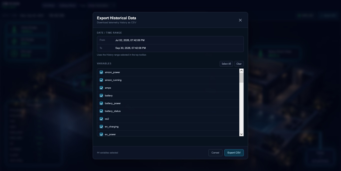
9. Export Data
Historical data can be downloaded from the SCADA Canvas.
Export Format
SCADA historical data is exported strictly as a CSV file.
CSV means:
Comma-Separated Values
Example filename:
scada-history.csv
CSV is a standard data format and can be opened directly by applications including:
- Microsoft Excel
- Google Sheets
- LibreOffice Calc
- Data analysis software
- Database import tools
The exported data contains timestamps and the selected telemetry variables.
A typical CSV may look similar to:
Timestamp ISO,Timestamp ms,tank_level,pressure,pump_running
2026-09-07T01:00:00.000Z,1788742800000,72.4,315.2,1
2026-09-07T01:00:10.000Z,1788742810000,72.6,314.9,1
2026-09-07T01:00:20.000Z,1788742820000,72.7,315.5,1
The export uses the selected historical time range.
This allows an operator to:
- Select a date range.
- Select the required telemetry variables.
- Export the information.
- Open the CSV immediately in Excel.
Large export ranges may be restricted to protect the Node-RED / PassPort system from excessive memory or processing load.
10. Adding and Managing Pages
A single SCADA Canvas can contain multiple pages.
This allows one SCADA URL to provide several organised screens.
Examples:
Overview
Pumps
Tanks
Bores
Water Treatment
Alarms
Electrical
Trends
Add Page
Use Add Page to create another SCADA workspace.
Each page has its own:
- Background
- Widgets
- Layout
- Controls
- Images
- Data displays
Rename Page
Pages can be renamed to suit the system.
For example:
Page 2
could become:
Bore Pumps
Delete Page
Pages that are no longer required can be removed.
Take care before deleting a page because Navigation Bar buttons or Action widgets may already point to it.
Default Page
One page can be selected as the default page.
This page opens automatically when the SCADA URL is opened.
11. How Pages Connect to Navigation
Pages can be connected to interactive widgets.
The two main methods are:
- Navigation Bar
- Action buttons
A Navigation Bar may contain buttons such as:
Overview
Tanks
Pumps
Trends
Each navigation button is linked to a SCADA page.
When the operator presses:
Tanks
the Canvas dynamically switches to the Tanks page.
The browser does not need to reload the entire SCADA system.
This allows a single dashboard to behave like a complete multi-screen HMI.
An Action widget can also be configured to open another page.
For example:
Overview
↓
Press "Pump Station 1"
↓
Pump Station 1 page opens
12. Input Pin — Live Data
The input on the left side of the Node-RED node receives live data.
The simplest and recommended format is a JSON object inside:
msg.payload
Example:
{
"tank_level": 72.4,
"pressure": 315.2,
"flow_rate": 18.7,
"pump_running": 1
}
The property names can be whatever suits the project.
Examples:
tank_level
pump_running
pump_fault
pressure
flow_rate
battery_voltage
bore_level
chlorine
temperature
wind_speed
wind_direction
There is no requirement to use those exact names.
You can create your own.
For example:
{
"bore_1_level": 1650,
"bore_1_run": 1,
"main_tank": 82,
"discharge_kpa": 420
}
Linking Data to a Widget
Each live-data widget has a Data Key or equivalent telemetry property.
If the incoming JSON contains:
{
"tank_level": 72.4
}
configure the widget Data Key as:
tank_level
The widget will then display:
72.4
If the incoming key changes to:
main_tank_level
configure the widget to use:
main_tank_level
The SCADA Canvas therefore does not force you to use fixed telemetry names.
The widget property simply needs to match the property name arriving in msg.payload.
13. Typical Live Data Flow
A basic Node-RED flow may look like:
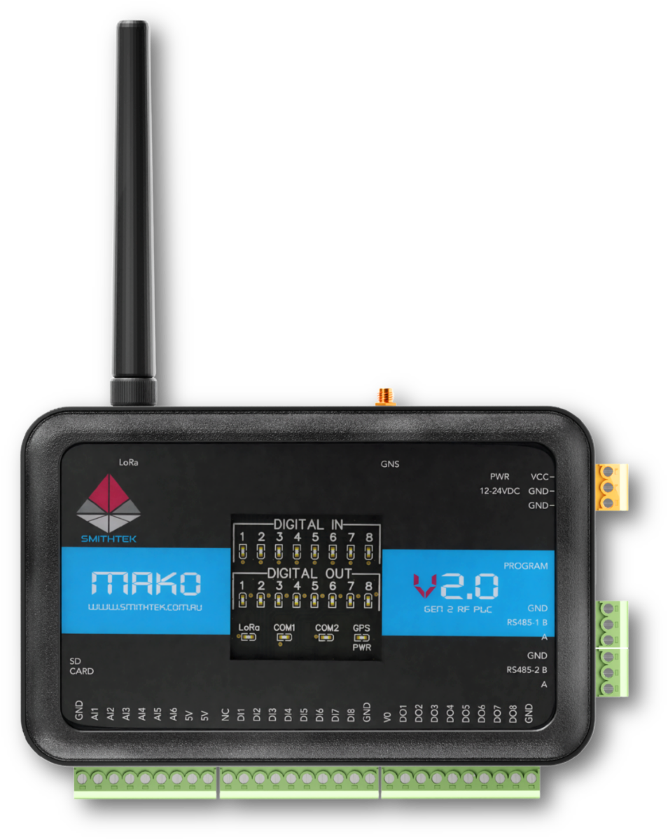
PLC / Modbus / Sensor / Mako
↓
Function Node
↓
3DM SCADA Canvas Input
Example Function node:
msg.payload = {
tank_level: 72.4,
pressure: 315.2,
pump_running: 1
};
return msg;
The SCADA Canvas receives the complete object and makes the property names available to compatible widgets.
14. Output Pin — Command Controls
The output pin on the right side of the SCADA node is used for commands.
When an operator interacts with a configured control widget in Live Mode, the SCADA Canvas automatically builds a JSON command and sends it into Node-RED.
For example, a control may be configured with:
Command Key: pump_mode_cmd
ON Value: on
Pressing ON can produce:
{
"pump_mode_cmd": "on"
}
Another project may use numeric commands:
{
"pump_cmd": 1
}
A stop command could be:
{
"pump_cmd": 0
}
That JSON object leaves through the node output as:
msg.payload
The output can then be connected to:
- Function nodes
- Modbus nodes
- MQTT nodes
- PLC logic
- Mako RF nodes
- Relay control
- Serial devices
- 3DM nodes
- Custom Node-RED logic
Example:
SCADA Control
↓
3DM SCADA Canvas Output
↓
Function Node
↓
PLC / Relay / Mako / Device
15. Command Feedback
A control command and equipment feedback are two different things.
For example, pressing:
PUMP ON
only means the SCADA has requested that the pump turn on.
For reliable operator feedback, use actual telemetry from the equipment.
Example:
Control Widget
pump_cmd = 1
and separately:
LED Widget
pump_running = 1
Recommended arrangement:
Control button = requested command
LED / Value = actual equipment feedback
This prevents an operator from assuming that a machine started simply because a button was pressed.
16. Live Data and Communications Health
The SCADA Canvas continuously monitors whether genuine new telemetry is arriving.
This is separate from simply having the browser connected.
A browser may still be connected to Node-RED while the field data itself has stopped.
The Data Health system therefore monitors actual incoming telemetry.
Before Data Arrives
Before the first genuine telemetry message arrives, the status displays:
WAITING FOR DATA
Healthy Communications
When new telemetry is arriving within the configured timeout period, the status displays:
DATA LIVE
The indicator is green.
This means the SCADA has recently received genuine new telemetry.
No Data Communications Timeout
If new telemetry stops arriving for longer than the configured No Data Communications Timeout, the status changes to:
NO NEW DATA
The indicator changes to red.
For example, if the timeout is:
300 seconds
and no new telemetry arrives for more than five minutes, the system declares the data stream stale.
This protects operators from assuming that an old frozen value is still live.
A displayed value may represent the last known reading, but once the dashboard reports NO NEW DATA, it must not be treated as a current process value.
The timeout is therefore the protection against frozen data being mistaken for live data.
17. Status LED Indicator
The SCADA toolbar includes a visual communications status indicator.
This is a software status LED, not a physical LED on the field hardware.
Its main states are:
Waiting
Grey
WAITING FOR DATA
The SCADA has opened but has not yet received genuine live telemetry.
Healthy
Green
DATA LIVE
New telemetry is arriving within the configured timeout.
Communications Timeout
Red
NO NEW DATA
No genuine new telemetry has arrived within the configured timeout period.
The status is based on new telemetry.
Cached values or simply refreshing the browser do not falsely reset the data-health timer.
When genuine telemetry begins arriving again, the indicator automatically returns to:
DATA LIVE
18. Adding a Backing Image
A background image can be placed underneath the complete SCADA page.
This is useful for creating a fixed visual floor plan.
Examples include:
- Piping diagrams
- P&ID-style layouts
- Plant drawings
- Bore layouts
- Mine site diagrams
- Tank farms
- Pump stations
- Building plans
- Process schematics
- Maps
- Equipment layouts
In Edit Mode select:
Background
Choose the required image.
The image becomes the fixed backing graphic underneath the widgets.
You can then place live SCADA elements over the top.
For example:
Background image
↓
Pipe drawing
↓
Live tank level
↓
Pump run LED
↓
Pressure gauge
↓
Control buttons
The background is intended to form part of the page itself and does not behave like a normal moveable widget.
19. Adding a Normal Image
The Image widget is different from the page background.
A normal Image behaves like a standard Canvas item.
Select:
+ Image
A new image placeholder is added.
Click the image and select a PNG.
The image can then be:
- Moved
- Resized
- Positioned anywhere on the canvas
- Selected like another widget
- Saved with the SCADA layout
Transparent PNG images retain their transparency.
This is useful for:
- Pumps
- Motors
- Valves
- Tanks
- Company logos
- Equipment symbols
- Process icons
- Custom SCADA graphics
For example, a transparent PNG pump can be placed directly over a backing process diagram without a rectangular white background.
The Image widget is stored by the SCADA server so it remains available after saving and refreshing the page.
20. Widget Directory
The SCADA Canvas includes a collection of widgets used to build complete graphical process screens.
The standard widget set includes:
Text
Rectangle / Panel
Line
Value
Gauge
Compass
Image
Trend
Wheel
LED
Control
Setpoints
Action
Navigation Bar
Table
Vertical Bar
Horizontal Bar
20.1 Text Widget
The Text widget adds fixed text to the Canvas.
Use it for:
- Equipment names
- Area names
- Section headings
- Instructions
- Notes
- Process labels
Examples:
BORE PUMP 1
MAIN STORAGE TANK
DISCHARGE PRESSURE
Text widgets do not normally require a telemetry key because the content is fixed.
See Widget Properties for details on properties like glow, corner radius, etc.
20.2 Rectangle / Panel Widget
The Rectangle widget creates a panel or rectangular area.
Use it to:
- Group related widgets
- Create equipment cards
- Create panel backgrounds
- Separate process areas
- Add borders around sections
- Improve dashboard layout
Example:
+---------------------------+
| BORE PUMP 1 |
| |
| Pressure: 320 kPa |
| Running: ● |
| |
+---------------------------+
The panel can sit behind Values, LEDs, Controls and other widgets.
See Widget Properties for details on properties like glow, corner radius, etc.
20.3 Line Widget
The Line widget creates graphical lines on the Canvas.
It is useful for:
- Pipework
- Process flow paths
- Electrical links
- Separators
- Connection lines
- Simple P&ID layouts
Lines can be configured to visually represent flow paths and may use animated flow effects where configured.
Example:
BORE 1 ─────────────── MAIN TANK
See Widget Properties for details on properties like glow, corner radius, etc.
20.4 Value Widget
The Value widget displays a live telemetry value.
Example incoming JSON:
{
"pressure": 315.2
}
Configure:
Data Key: pressure
Units: kPa
Decimals: 1
The display may show:
315.2 kPa
Typical uses include:
- Pressure
- Flow
- Voltage
- Current
- Temperature
- Tank level
- Run hours
- Totalisers
- RPM
- Frequency
See Widget Properties for details on properties like glow, corner radius, etc.
20.5 Gauge Widget
The Gauge widget displays live numeric data on a graphical scale.
Example:
Data Key: pressure
Minimum: 0
Maximum: 600
Units: kPa
Typical uses include:
- Pressure
- Flow
- Speed
- Voltage
- Current
- Temperature
- Level
Gauge settings can include minimum and maximum values, tick divisions, units and display formatting.
See Widget Properties for details on properties like glow, corner radius, etc.
20.6 Compass Widget
The Compass widget displays directional telemetry.
It is particularly useful for:
- Wind direction
- Heading
- Orientation
- Directional sensors
The Compass can use a direction telemetry key.
Example:
{
"wind_direction": 207,
"wind_speed": 13.4
}
The widget can display:
- Compass needle
- Degrees
- Cardinal direction
- North, East, South and West markings
- Wind speed
- Direction text
The direction and wind-speed data can use separate telemetry keys.
See Widget Properties for details on properties like glow, corner radius, etc.
20.7 Image Widget
The Image widget adds a normal graphical image to the Canvas.
Unlike a backing image, it behaves as a standard widget.
Use it for:
- Pumps
- Tanks
- Motors
- Valves
- Equipment
- Symbols
- Logos
- Process graphics
Transparent PNG files remain transparent.
The image can be moved and resized anywhere on the page.
See Widget Properties for details on properties like glow, corner radius, etc.
20.8 Trend Widget
The Trend widget displays historical telemetry directly on the Canvas.
Use it for:
- Tank level history
- Pressure trends
- Flow trends
- Temperature history
- Battery voltage
- Process behaviour
- Equipment performance
Example:
Data Key: tank_level
Trend configuration can include:
- Chart title
- Data key
- Time range
- Axis visibility
- Y-axis limits
- Line width
- Smoothing
- Fill
- Gradient
- Number of displayed points
- Date format
- Zoom interaction
The global date-range controls can also be used when investigating historical periods.
See Widget Properties for details on properties like glow, corner radius, etc.
20.9 Wheel Widget
The Wheel widget is a rotating equipment indicator.
It is useful for:
- Pumps
- Fans
- Motors
- Blowers
- Agitators
- Rotating machinery
A telemetry key can be used to determine whether the equipment should appear stopped or running.
Example:
{
"pump_running": 1
}
When configured for that key, the Wheel provides an immediate graphical indication of equipment operation.
See Widget Properties for details on properties like glow, corner radius, etc.
20.10 LED Widget
The LED widget displays a telemetry state using colour.
Typical applications include:
- Running
- Stopped
- Fault
- Alarm
- Valve open
- Valve closed
- Relay state
- Communications state
Example:
{
"pump_state": 1
}
An LED may be configured with rules such as:
0 = Grey
1 = Green
2 = Red
LED states can also be configured to flash where required.
This makes one LED capable of displaying several equipment conditions.
See Widget Properties for details on properties like glow, corner radius, etc.
20.11 Control Widget
The Control widget allows an operator to send commands.
Typical commands include:
- ON
- OFF
- START
- STOP
- AUTO
- MANUAL
- RESET
- OPEN
- CLOSE
Example configuration:
Command Key: pump_cmd
ON Value: 1
OFF Value: 0
Pressing ON can create:
{
"pump_cmd": 1
}
Pressing OFF can create:
{
"pump_cmd": 0
}
The JSON command leaves through the SCADA Canvas Node-RED output.
Actual equipment feedback should normally be displayed separately using live telemetry.
See Widget Properties for details on properties like glow, corner radius, etc.
20.12 Setpoints Widget
The Setpoints widget displays configurable process values.
Typical examples include:
Start Level
Stop Level
Pressure Setpoint
Flow Setpoint
Temperature Limit
Low Alarm
High Alarm
A setpoint section may look similar to:
Start Level 1500
Stop Level 1700
High Pressure 600
Setpoints allow operator-adjustable values to be presented clearly without creating a separate control for every number.
Where a setpoint generates a command, the resulting information is passed into Node-RED through the Canvas output.
See Widget Properties for details on properties like glow, corner radius, etc.
20.13 Action Widget
The Action widget is a general-purpose SCADA button.
Unlike a machinery Control widget, an Action is normally used for dashboard navigation or information.
Typical actions include:
- Open another page
- Open a trend
- Open detailed information
- Change dashboard view
Example:
View Pump Details
may open:
Pump Station Page
Another Action may be:
View Pressure History
which opens the configured trend.
See Widget Properties for details on properties like glow, corner radius, etc.
20.14 Navigation Bar Widget
The Navigation Bar provides structured page navigation.
Example:
Overview
Pumps
Tanks
Trends
Each tab is connected to a SCADA page.
Pressing a tab dynamically switches the active page.
This is useful for larger SCADA projects because it allows one Canvas system to contain multiple organised screens.
The Navigation Bar can be resized and positioned as part of the dashboard design.
See Widget Properties for details on properties like glow, corner radius, etc.
20.15 Table Widget
The Table widget displays several telemetry values together.
Example:
Bore 1 Level 1850 mm
Bore 1 Pressure 420 kPa
Bore 1 Flow 18 L/s
Bore 1 Running Yes
Each row can be connected to a different telemetry key.
Tables are useful when a graphical gauge is unnecessary and several related values need to be displayed in a compact area.
Typical uses include:
- Pump information
- Generator status
- Electrical readings
- Water-quality measurements
- Site summaries
- Multiple sensor values
See Widget Properties for details on properties like glow, corner radius, etc.
20.16 Vertical Bar Widget
The Vertical Bar displays a value as a vertical fill.
It is particularly useful for tank-style displays.
Typical uses include:
- Tank level
- Bore level
- Chemical storage
- Silo level
- Battery state
- Reservoir level
Example:
Data Key: tank_level
Minimum: 0
Maximum: 100
Units: %
As the incoming value rises, the vertical fill rises.
See Widget Properties for details on properties like glow, corner radius, etc.
20.17 Horizontal Bar Widget
The Horizontal Bar displays a value as a horizontal progress-style fill.
Typical uses include:
- Pump speed
- Motor load
- Battery level
- Flow percentage
- Process progress
- Capacity
- Output percentage
Example:
Data Key: pump_speed
Minimum: 0
Maximum: 100
Units: %
A value of:
75
would display approximately three quarters of the bar filled.
See Widget Properties for details on properties like glow, corner radius, etc.
21. Typical SCADA Example
Incoming Node-RED telemetry:
{
"tank_level": 72.4,
"pressure": 315.2,
"flow_rate": 18.7,
"pump_running": 1
}
Canvas configuration:
Vertical Bar
Data Key: tank_level
Gauge
Data Key: pressure
Value
Data Key: flow_rate
LED
Data Key: pump_running
The operator sees:
Tank Level 72.4 %
Pressure 315.2 kPa
Flow 18.7 L/s
Pump RUNNING
If the operator presses the Pump OFF Control:
{
"pump_cmd": 0
}
is sent from the output of the SCADA Canvas node.
Node-RED then decides what happens next.
22. Recommended Node-RED Structure
A typical complete system may look like:
FIELD DATA
↓
Modbus / MQTT / RF / PLC / Sensors
↓
Function / Scaling Logic
↓
3DM SCADA Canvas
↓
Live SCADA Display
For commands:
Operator presses SCADA control
↓
3DM SCADA Canvas Output
↓
Function / Safety Logic
↓
PLC / Modbus / RF / Relay / Equipment
Always perform required command validation and safety logic after the SCADA output before operating equipment.
23. Building a New SCADA Screen
A simple workflow is:
- Add the 3DM SCADA Canvas node to Node-RED.
- Connect live telemetry to the input.
- Deploy Node-RED.
- Read the generated SCADA address underneath the node.
- Open the SCADA URL.
- Enter Settings and configure the Server Name and URL Name if required.
- Enter Edit Mode.
- Add a backing image if required.
- Enable the grid.
- Enable Snap to Grid if required.
- Add Text labels.
- Add Value widgets.
- Add Gauges.
- Add LEDs.
- Add Bars.
- Add equipment Images.
- Add Controls.
- Add Trends.
- Add extra pages if required.
- Add a Navigation Bar.
- Press Save.
- Switch to Live Mode.
- Confirm the Data Health indicator shows DATA LIVE.
- Test controls carefully.
- Confirm live feedback is received from the equipment.
24. Troubleshooting
SCADA Page Does Not Open
Check the URL shown underneath the Node-RED node.
If the status is:
/scada/scada-a1b2c3d4
and Node-RED is on your own computer, try:
http://127.0.0.1:1880/scada/scada-a1b2c3d4
If Node-RED is on another device, do not use 127.0.0.1.
Use that device's IP address or hostname.
Dashboard Says WAITING FOR DATA
The SCADA page is running, but genuine telemetry has not yet arrived.
Check:
- The node input is connected.
msg.payloadcontains data.- The Node-RED flow is deployed.
- The upstream device is running.
- The telemetry message is reaching the Canvas node.
Dashboard Says NO NEW DATA
Telemetry was previously received but has stopped for longer than the configured timeout.
Check:
- Field communications
- PLC connection
- Modbus
- MQTT
- RF
- Serial communications
- Upstream Node-RED nodes
- Sensor power
- Network connection
Do not assume displayed last-known values are still current while NO NEW DATA is shown.
Widget Shows No Value
Check that the Data Key exactly matches the incoming JSON property.
Incoming:
{
"tank_level": 72.4
}
Correct:
tank_level
Incorrect:
Tank Level
unless the incoming JSON property is actually called Tank Level.
Property names must match.
Control Does Not Operate Equipment
Check whether the SCADA node output receives the JSON command.
For example:
{
"pump_cmd": 1
}
If the command leaves the Canvas correctly, check the downstream Node-RED control logic.
The SCADA Canvas creates the operator command, but the connected Node-RED flow determines how that command reaches the equipment.
Changes Disappear After Refresh
Make sure Save was pressed before refreshing or closing the browser.
25. Global Widget Properties
Widget Properties control how individual SCADA items look and behave.
Not every property is available on every widget. The property panel changes depending on the selected widget.
Data Key
The Data Key links a widget to an incoming JSON property.
Example incoming data:
{
"tank_level": 72.4
}
Use:
Data Key: tank_level
Label
The Label is the human-readable name shown with a widget.
Examples:
Tank Level
Discharge Pressure
Bore Pump 1
The Label does not have to match the Data Key.
For example:
Data Key: b1_press
Label: Bore 1 Pressure
Units
Units are displayed with numeric values.
Examples:
%
kPa
L/s
mm
V
A
Hz
°C
rpm
Decimal Places
Decimal settings control numeric precision.
For example:
Raw value: 315.2468
With one decimal:
315.2
With two decimals:
315.25
Minimum and Maximum
Widgets such as Gauges and Bars use minimum and maximum values to calculate their visual range.
Example:
Minimum: 0
Maximum: 4000
Position
Widgets can be moved around the Canvas in Edit Mode.
Use the grid and Snap to Grid for consistent alignment.
Width and Height
Widgets can be resized using their Edit Mode resize controls.
The ideal size depends on:
- Screen resolution
- Dashboard layout
- Operator viewing distance
- Number of widgets
- Type of widget
Colours
Many widgets allow separate colours for:
- Main value
- Label
- Background
- Border
- Fill
- Accent
- Active state
- Inactive state
- Alarm state
Use colour consistently across a SCADA project.
For example:
Green = Running / Healthy
Red = Fault / Alarm
Grey = Stopped / Inactive
Blue = Process / Water
Amber = Warning
Glow Effects
Glow adds a luminous SCADA-style effect around an item.
Depending on the widget, available settings may include:
- Glow Colour
- Glow Size
- Glow Strength
- Accent Glow
A small glow can improve contrast on dark SCADA backgrounds.
A very large glow can make the screen difficult to read, so use glow as an accent rather than as the main visual feature.
Example:
Glow Colour: Cyan
Glow Size: 10
For transparent PNG Image widgets, the glow follows the visible PNG shape rather than creating a rectangular box around the image.
Corner Radius
Corner Radius controls how rounded the corners of a panel or card appear.
Example:
0 px
creates square corners.
A larger value such as:
12 px
creates a softer rounded panel.
Corner radius is commonly used on:
- Panels
- Trends
- Navigation areas
- Cards
- Controls
Borders
Borders define the edge of a widget.
Properties may include:
- Border Colour
- Border Width
- Border Opacity
A subtle border can separate a widget from a dark background without making the interface look cluttered.
Outlines
An outline is similar to a border but may be used to emphasise the outside edge of a widget or selected state.
Outlines are useful for:
- Active controls
- Selected items
- Equipment states
- High-importance information
Avoid using strong outlines on every item because this can make the dashboard visually crowded.
Opacity
Opacity controls how transparent an item appears.
Typical values range from:
0 = Fully transparent
1 = Fully visible
Examples:
0.25 = Very transparent
0.50 = Half transparent
0.75 = Mostly visible
1.00 = Fully visible
Opacity is particularly useful for:
- Panels over backing images
- Images
- Bar fills
- Trend backgrounds
- Decorative overlays
Shadows
Shadows create separation between a widget and the background.
They can be used to create:
- Depth
- Raised cards
- Equipment emphasis
- Dark panel separation
A subtle shadow is generally easier to read than a very strong shadow.
Fill Opacity
Some widgets have separate opacity controls for their internal fill.
This allows the border to remain clearly visible while making the centre partially transparent.
Useful for:
- Rectangles
- Panels
- Bars
- Trend areas
Font Size
Text-based widgets may allow separate sizes for:
- Main value
- Label
- Title
- Secondary information
Make important process values larger than supporting labels.
For example:
Tank Level
76 %
The numeric value should normally be visually stronger than the label.
Widget Backgrounds
Some widgets support a panel or card background.
A semi-transparent background is useful when the SCADA uses a detailed backing image.
Example:
Dark background
70% opacity
This keeps telemetry readable while allowing the process drawing underneath to remain visible.
State Colours
Widgets such as LEDs and Controls can use different colours for different states.
Example:
0 = Grey
1 = Green
2 = Red
This is particularly useful for:
- Running
- Stopped
- Fault
- Warning
- Valve state
- Communications
Flashing States
LED rules can be configured to flash for important conditions.
For example:
0 = Grey
1 = Green
2 = Flashing Red
Use flashing states primarily for conditions requiring operator attention.
Chart Appearance
Trend widgets provide additional chart-specific properties such as:
- Line width
- Line colour
- Text colour
- Grid colour
- Axis visibility
- Legend
- Smoothing
- Gradient
- Fill opacity
- Background opacity
- Chart glow
- Corner radius
- Y-axis minimum
- Y-axis maximum
Image Appearance
Image widgets can include properties such as:
- Opacity
- Glow Colour
- Glow Size
Transparent PNG backgrounds remain transparent.
This makes them particularly suitable for industrial equipment symbols placed over SCADA process diagrams.
Saving Widget Properties
After changing widget properties:
Press Save
The Canvas status will indicate when changes are waiting to be saved.
Always save the page before refreshing the browser or leaving Edit Mode when permanent layout changes are required.