node-red-contrib-step-escape 1.0.42
A custom Node-RED Dashboard node that displays a block with a dark background, grey right border, full tab height, and 35% width.
🧩 Node-RED Step Escape
Step Escape est une node personnalisée pour Node-RED conçue spécialement pour les escape games. Elle permet de suivre l'avancée des énigmes en temps réel avec une interface claire et interactive.
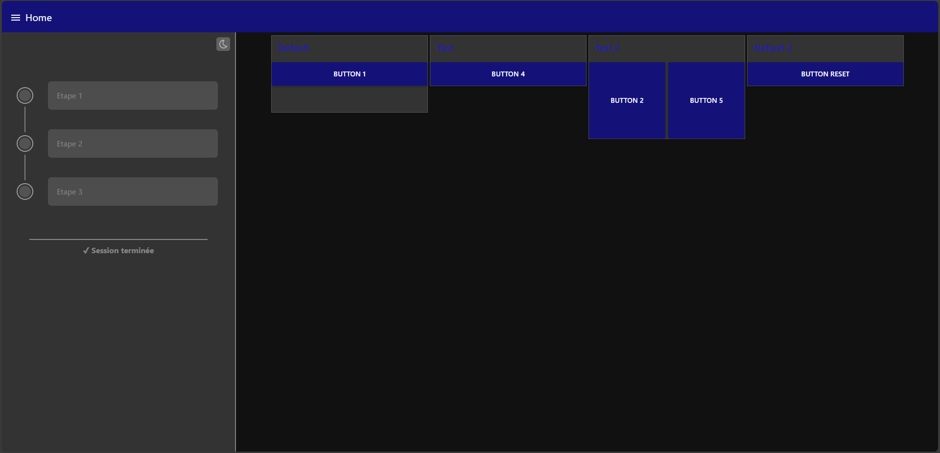
📸 Aperçu
Interface dans le dashboard :
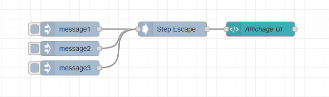
Exemple de configuration de la node :
⚙️ Fonctionnement
- Chaque étape possède un nom et une valeur de validation.
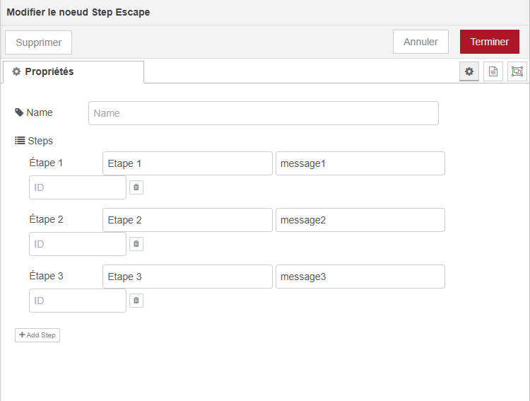
- Lorsqu'un
msg.payloadcorrespond à une étape, celle-ci est validée (en vert). - La suivante passe en attente (orange).
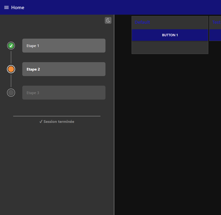
- Si une étape est validée hors ordre, elle passe en ordre invalide (bleu).
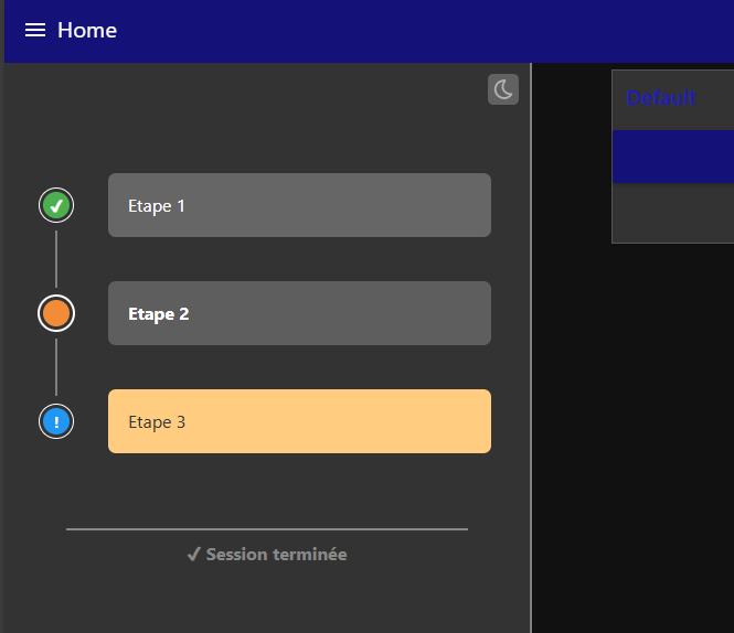
🔁 Réinitialisation
Envoyer msg.payload = "reset" pour réinitialiser toutes les étapes.
🆔 Champ ID
Le champ ID est pour l’instant inutilisé. Il peut rester vide.
🧩 Prérequis
- Node-RED >= 3.x
- node-red-dashboard
- Une
ui_templatepersonnalisée à connecter pour l’affichage
🔌 Connexion
Connectez la node step-escape directement à une ui_template pour la transmission des étapes.
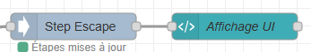
Code node ui-template (affichage)
Voici le code JSON de la node ui_template
[{"id":"f2e6cf9d10d52705","type":"ui_template","z":"f28c8fd26da314f6","group":"c3d4e5f6.a7b8c9","name":"Affichage UI","order":3,"width":0,"height":0,"format":"<div id=\"custom-block\" class=\"dark-theme\" style=\"\n position: fixed;\n left: 0;\n top: 64px;\n border-right: 2px solid #808080;\n height: -webkit-fill-available;\n width: 25vw;\n box-sizing: border-box;\n z-index: 1;\n\">\n <div class=\"fade-top\"></div>\n\n <button id=\"theme-toggle\">\n <img id=\"theme-icon\" src=\"https://cine-production.github.io/ServiceTiers/BASEDONNEE/node-red/dark.svg\" alt=\"theme icon\" style=\"height: -webkit-fill-available;\">\n </button>\n\n <div id=\"steps-container\" style=\"padding: 10px;\">\n <div ng-repeat=\"step in msg.payload track by $index\" class=\"step-wrapper\">\n <div class=\"timeline\">\n <div class=\"circle\" ng-class=\"{\n 'line-top': $index > 0,\n 'line-bottom': $index < msg.payload.length - 1,\n 'validated': step.state === 'validated',\n 'in-progress': step.state === 'in-progress',\n 'not-executed': step.state === 'not-executed' || !step.state,\n 'invalid-order': step.state === 'invalid-order'\n }\">\n <span class=\"circle-icon\" ng-if=\"step.state === 'validated'\">✔</span>\n <span class=\"circle-icon\" ng-if=\"step.state === 'invalid-order'\">!</span>\n </div>\n </div>\n <div class=\"step-item\" ng-class=\"{\n 'validated': step.state === 'validated',\n 'in-progress': step.state === 'in-progress',\n 'not-executed': step.state === 'not-executed' || !step.state,\n 'invalid-order': step.state === 'invalid-order'\n }\">\n {{step.name || 'Unnamed Step'}}\n </div>\n </div>\n <div class=\"session-end-indicator\" ng-class=\"{'complete': isSessionComplete}\">\n <hr class=\"session-line\">\n <div class=\"session-text\">✔ Session terminée</div>\n </div>\n\n </div>\n <div class=\"fade-bottom\"></div>\n</div>\n</div>\n\n<script>\n (function(scope) {\n // Handle theme\n const block = document.getElementById(\"custom-block\");\n const toggleBtn = document.getElementById(\"theme-toggle\");\n const themeIcon = document.getElementById(\"theme-icon\");\n\n const applyTheme = (theme) => {\n console.log(\"UI: Applying theme\", theme);\n if (theme === \"light\") {\n block.classList.remove(\"dark-theme\");\n block.classList.add(\"light-theme\");\n themeIcon.src = \"https://cine-production.github.io/ServiceTiers/BASEDONNEE/node-red/light.svg\";\n } else {\n block.classList.remove(\"light-theme\");\n block.classList.add(\"dark-theme\");\n themeIcon.src = \"https://cine-production.github.io/ServiceTiers/BASEDONNEE/node-red/dark.svg\";\n }\n };\n\n const savedTheme = localStorage.getItem(\"customBlockTheme\") || \"dark\";\n applyTheme(savedTheme);\n\n toggleBtn.addEventListener(\"click\", () => {\n const newTheme = block.classList.contains(\"dark-theme\") ? \"light\" : \"dark\";\n localStorage.setItem(\"customBlockTheme\", newTheme);\n applyTheme(newTheme);\n });\n\n // Log received messages\n scope.$watch('msg', function(msg) {\n console.log(\"UI: Received message:\", msg);\n if (msg && msg.topic === 'update_steps' && Array.isArray(msg.payload)) {\n console.log(\"UI: Updating steps:\", JSON.stringify(msg.payload));\n }\n });\n scope.$watch('msg.payload', function(steps) {\n if (Array.isArray(steps)) {\n scope.isSessionComplete = steps.every(step => step.state === 'validated');\n } else {\n scope.isSessionComplete = false;\n }\n});\n })(scope);\n</script>\n\n<style>\n .session-text {\n font-size: 16px;\n font-weight: bold;\n color: #888;\n /* gris par défaut */\n transition: color 0.3s ease;\n }\n\n .session-end-indicator.complete .session-text {\n animation: all 2s ease-in-out;\n color: #4caf50;\n font-weight: bold;\n transform: scale(1.2);\n }\n\n .session-end-indicator .session-line {\n width: 80%;\n border: none;\n border-top: 2px solid #888;\n /* gris par défaut */\n margin-bottom: 10px;\n transition: border-color 0.3s ease;\n }\n\n .session-end-indicator.complete .session-line {\n border-color: #4caf50;\n /* vert quand terminé */\n }\n\n .session-end-indicator {\n display: flex;\n flex-direction: column;\n align-items: center;\n margin-top: 60px;\n margin-bottom: 30px;\n text-align: center;\n }\n\n .session-line {\n width: 80%;\n border: none;\n border-top: 2px solid #4caf50;\n margin-bottom: 10px;\n }\n\n\n\n #theme-toggle {\n position: absolute;\n top: 10px;\n right: 10px;\n padding: 5px;\n background-color: transparent;\n border: none;\n cursor: pointer;\n border-radius: 5px;\n width: 28px;\n height: 28px;\n display: flex;\n align-items: center;\n justify-content: center;\n z-index: 2;\n }\n\n #custom-block.dark-theme {\n background-color: #333;\n color: white;\n }\n\n #custom-block.light-theme {\n background-color: #f1f1f1;\n color: black;\n }\n\n .step-item.light-theme {\n background-color: #f1f1f1;\n color: black;\n }\n\n #custom-block.light-theme #theme-toggle {\n background-color: #d3d3d3;\n color: #636363;\n }\n\n #custom-block.light-theme #theme-toggle img {\n filter: brightness(0.4);\n }\n\n #custom-block.dark-theme #theme-toggle {\n background-color: #616161;\n color: #dddddd;\n }\n\n #custom-block.dark-theme #theme-toggle img {\n filter: brightness(0.7);\n }\n\n .layout-row {\n width: 75vw;\n margin-left: auto;\n }\n\n .fade-top,\n .fade-bottom {\n position: absolute;\n left: 0;\n width: 100%;\n height: 60px;\n pointer-events: none;\n z-index: 2;\n }\n\n .fade-top {\n top: 0;\n background: linear-gradient(to bottom, #333, transparent);\n }\n\n .fade-bottom {\n bottom: 0;\n background: linear-gradient(to top, #333, transparent);\n }\n\n #custom-block.light-theme .fade-top {\n background: linear-gradient(to bottom, #f1f1f1, transparent);\n }\n\n #custom-block.light-theme .fade-bottom {\n background: linear-gradient(to top, #f1f1f1, transparent);\n }\n\n #steps-container {\n overflow: scroll;\n scrollbar-width: none;\n /* Firefox */\n -ms-overflow-style: none;\n /* IE/Edge */\n height: -webkit-fill-available;\n }\n\n #steps-container::-webkit-scrollbar {\n display: none;\n /* Chrome, Safari, Edge */\n }\n\n .step-wrapper {\n display: flex;\n align-items: center;\n gap: 35px;\n padding: 0px 25px;\n margin-bottom: 40px;\n }\n\n #steps-container>*:first-child {\n margin-top: 90px;\n }\n\n #steps-container>*:last-child {\n margin-bottom: 300px;\n }\n\n .timeline {\n position: relative;\n width: 24px;\n display: flex;\n justify-content: center;\n align-items: center;\n flex-shrink: 0;\n }\n\n .circle {\n width: 24px;\n height: 24px;\n border-radius: 50%;\n position: relative;\n z-index: 1;\n outline-style: solid;\n outline-offset: 3px;\n display: flex;\n align-items: center;\n justify-content: center;\n transition: background-color 0.3s ease, outline-width 0.3s ease, transform 0.3s ease;\n }\n\n .step-item:hover {\n transform: scale(1.05);\n }\n\n .circle-icon {\n color: white;\n font-size: 14px;\n font-weight: bold;\n transition: opacity 0.3s ease;\n }\n\n .circle.line-top::before,\n .circle.line-bottom::after {\n content: \"\";\n position: absolute;\n width: 2px;\n background-color: gray;\n left: 50%;\n transform: translateX(-50%);\n transition: background-color 0.3s ease;\n }\n\n .circle.line-top::before {\n top: -39px;\n height: 28px;\n }\n\n .circle.line-bottom::after {\n bottom: -39px;\n height: 28px;\n }\n\n .step-item {\n flex: 1;\n font-size: 16px;\n padding: 18px;\n border-radius: 7px;\n height: 22px;\n transition: background-color 0.3s ease, color 0.3s ease, transform 0.3s ease, font-weight 0.3s ease;\n }\n\n .circle.not-executed {\n background-color: #535353 !important;\n outline-color: #9b9b9b !important;\n outline-width: 2px !important;\n }\n\n .step-item.not-executed {\n background: #4d4d4d !important;\n color: #888 !important;\n }\n\n .circle.in-progress {\n background-color: #f28c38 !important;\n outline-color: #ffffff !important;\n outline-width: 2px !important;\n }\n\n .step-item.in-progress {\n background: #5e5e5e !important;\n color: #ffffff !important;\n font-weight: bold !important;\n }\n\n .circle.validated {\n background-color: #4caf50 !important;\n outline-color: #ffffff !important;\n outline-width: 1px !important;\n }\n\n .step-item.validated {\n background: #666666 !important;\n color: #ffffff !important;\n font-weight: normal !important;\n }\n\n .circle.invalid-order {\n background-color: #2196F3 !important;\n outline-color: #ffffff !important;\n outline-width: 1px !important;\n }\n\n .step-item.invalid-order {\n background: #FFCC80 !important;\n color: #333333 !important;\n font-weight: normal !important;\n }\n</style>","storeOutMessages":true,"fwdInMessages":true,"resendOnRefresh":true,"templateScope":"local","className":"","x":1290,"y":500,"wires":[[]]},{"id":"c3d4e5f6.a7b8c9","type":"ui_group","name":"Default","tab":"d4e5f6a7.b8c9d0","order":1,"disp":true,"width":"6","collapse":false},{"id":"d4e5f6a7.b8c9d0","type":"ui_tab","name":"Home","icon":"dashboard","order":1,"disabled":false,"hidden":false}]