node-red-contrib-interactive-inject 1.2.2
A Node-RED node with an interactive slider or preset buttons rendered directly on the canvas for one-click value injection — no dashboard required
node-red-contrib-interactive-inject
A Node-RED node that renders an interactive widget directly on the editor canvas — no dashboard required. Choose between a numeric slider or a set of preset buttons; either way, clicking or dragging injects a value straight into your flow.
Features
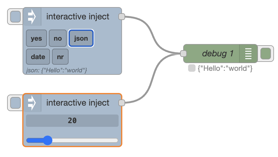
- Two modes selectable per node: Slider and Preset buttons
- Slider mode — inline
<input type="range">embedded in the node body; drag the thumb or click the number and type directly; press Enter to commit or Escape to cancel - Preset buttons mode — configurable buttons rendered on the canvas; each button has a label and an arbitrary typed value (string, number, boolean, JSON, JSONata, …); hovering a button previews its value before you click
- Configurable output property — write the injected value to any message property (default:
msg.payload), including nested paths such asmsg.data.value - Full message output (preset buttons) — optionally send the evaluated result as the entire
msgobject instead of a single property - Node status indicator — last injected value shown below the node after each injection
- Auto-label presets — if a preset label is left blank, the value string is used as the label automatically
- Configurable send behaviour (slider mode) — choose between injecting on release, while dragging (fires on every value change during drag), or never (button only)
- JSONata output (slider mode) — optionally shape the injected message with a JSONata expression; the slider's live value is available as
$value - Auto-collapse — optional: widget collapses to normal node height after 3 s of inactivity, expands on hover
- Left-side inject button for manual triggering, like the built-in Inject node
- Last value/selection persisted to
flows.json— survives deploy and restart - Configurable label and topic for both modes
- Works with Node-RED 3.x and above; no dependency on node-red-dashboard
Installation
Install from your Node-RED user directory (typically ~/.node-red):
npm install node-red-contrib-interactive-inject
Or via the Node-RED palette manager: search for interactive-inject.
Usage
- Drag the interactive inject node from the common category onto the canvas.
- Open the edit panel and choose a Mode: Slider or Preset buttons.
Slider mode
- Drag the slider thumb to your desired value, or click the number display and type a value directly.
- The Send option controls when injection happens: on release (default) injects once when you let go or press Enter; while dragging injects continuously as the value changes during a drag (and on Enter); never disables automatic injection so only the left-side button triggers it.
- The Output option controls what gets written to the Property field: raw value (default) sends the plain number; JSONata expression evaluates an expression with the slider value bound to
$value, letting you shape the payload — e.g.{ "/Soc": $value }. - Click the button on the left side of the node to inject the current value manually at any time.
Preset buttons mode
- Add one or more presets in the edit panel — give each a label and a value (any supported type). If you leave the label blank it defaults to the value string.
- The buttons appear directly on the canvas; hover a button to preview its value, click to inject.
- The last clicked preset is highlighted and re-injected when the left-side button is pressed.
- Tick full msg on a preset to send the evaluated result as the entire message object (useful with JSON/JSONata presets that define the full message structure).
Output
| Property | Type | Description |
|---|---|---|
| (configured property) | any | The injected value, written to the property set in the Property field (default: msg.payload) |
msg.topic |
string |
The topic configured in the edit panel (empty string if not set) |
msg.label |
string |
(Preset buttons mode only) The label of the clicked button |
Configuration
Common
| Property | Default | Description |
|---|---|---|
| Topic | (empty) | Sets msg.topic on every injected message |
| Property | payload |
The message property to write the injected value to (any path, e.g. data.value) |
| Mode | Slider |
Choose between Slider and Preset buttons |
Slider mode
| Property | Default | Description |
|---|---|---|
| Min | 0 |
Minimum slider value |
| Max | 100 |
Maximum slider value |
| Step | 1 |
Increment between positions (decimals supported, e.g. 0.1) |
| Default | 50 |
Value on first load |
| Send | on release |
When to inject: on release — once when the thumb is released or Enter pressed; while dragging — on every value change during drag (and on Enter); never — button only |
| Output | raw value |
raw value sends the plain number to the Property field; JSONata expression evaluates the expression below with the slider value bound to $value and writes the result to Property instead |
| Expr | $value |
(Output: JSONata expression only) The JSONata expression to evaluate, e.g. { "/Soc": $value } |
Preset buttons mode
| Property | Description |
|---|---|
| Presets | Ordered list of buttons. Each entry has a Label (shown on the button; auto-filled from the value if left blank), a Value with a type selector (string, number, boolean, JSON, JSONata, …), and an optional full msg toggle |
Widget behaviour
| Property | Default | Description |
|---|---|---|
| Auto-collapse | false |
When enabled, the widget collapses to normal node height 3 s after the cursor leaves the node, and re-expands immediately on hover |
Using the label in a JSONata preset value
When the value type is set to J: expression (JSONata), the button's label is available as the variable label. This lets you encode a parameter directly in the button name and reference it in the expression without duplication.
Example — button label 2000, value type JSONata:
{ "offset": $number(label) }
Produces msg.payload = { "offset": 2000 } and msg.label = "2000".
A more complete example — label now +2m: 5k, value type JSONata:
{
  "lowerLimit": -5000,
  "upperLimit": 5000,
  "duration": 900000,
  "executionTime": $millis() + 2 * 60 * 1000
}
Here the execution time is computed at the moment the button is pressed, so it always reflects the actual current time plus the offset.
Wrapping the value in a JSON object
To output { "/Temperature": 25 } instead of a plain number, set the slider's Output option to JSONata expression and enter:
{ "/Temperature": $value }
$value is bound to the slider's current value at the moment of injection — no downstream Change node required. See Import → Examples → node-red-contrib-interactive-inject → slider-jsonata-output in the Node-RED editor for a ready-made example.
If you're on an older version without the built-in Output option, the same result can be achieved with a separate Change node after this one (Action: Set, Target: msg.payload, Type: J: expression, Value: {"/Temperature": payload}) — see the basic-usage example below.
Additional examples are available under the same import path:
| Example | Description |
|---|---|
slider-jsonata-output |
Slider using the built-in Output: JSONata expression option to wrap the value in a JSON key |
basic-usage |
Slider with a separate Change node that wraps the value in a JSON key (pre-1.2.1 approach) |
preset-buttons |
Preset buttons mode with string, number, boolean, and JSON value types |
preset-jsonata-label |
Preset buttons with JSONata expressions that reference the button label via label |
Development
# Install dependencies
npm install

# Compile TypeScript and copy HTML to dist/
npm run build

# Watch mode
npm run watch

# Run tests
npm test
The runtime node is in src/interactive-inject.ts; the editor template and canvas rendering are in src/interactive-inject.html.
License
MIT © Dirk-Jan Faber