@vincentgloss/node-red-dashboard-2-ui-speed-dial 1.0.0
Floating action button (FAB) and speed dial menu for Node-RED FlowFuse Dashboard 2.0: row, menu list or radial circle, floating, in a group or in the header, with Material Design icons, badge counter and runtime control
Speed Dial – Floating Action Button for FlowFuse Dashboard
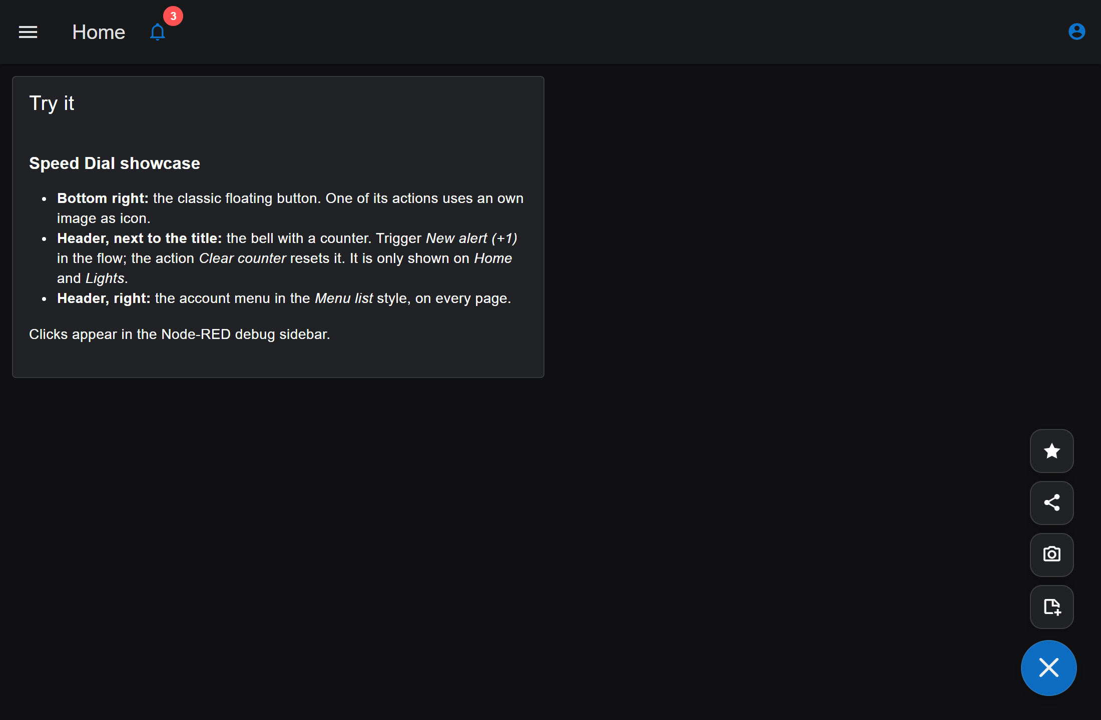
A floating action button (FAB) with a speed dial menu for FlowFuse Dashboard 2.0, the dashboard for Node-RED. One click opens a compact menu of actions – as a row, a menu list or a circle – and every action sends a message into your flow.
Set it up entirely in the Node-RED editor, with a live preview and without writing code. When you need more, every part of it can be changed from your flows at runtime.
English | Deutsch
Contents
Features · Requirements · Installation · Quick start · Where it appears · Styles · The editor · Icons · Colors and theme · Counter badge · Control from a flow · Output · Examples · Troubleshooting · Development · License
Features
| Area | What you get |
|---|---|
| Placement | In a dashboard group, floating over the page, or in the Dashboard header – on one page, on selected pages, or on all pages |
| Styles | Row, row with text, menu list, half circle, quarter circle, full circle |
| Actions | Up to 100 per button. Each sends its own payload (text, number, boolean, JSON or null) and an optional topic |
| Icons | 314 PrimeIcons, more than 7,000 Material Design Icons (the same as in the other Dashboard widgets), or your own images |
| Appearance | Follows your Dashboard theme automatically. Own colors, full transparency, sizes, corner radius, shadow |
| Counter badge | A small number or short text on the button, for example the number of open alerts |
| Runtime control | Replace, change or remove actions and change any setting by message – for everybody or for a single browser |
| Editor | Live preview, visual pickers, searchable icon picker, plain-language error messages, English and German |
| Accessibility | Keyboard operation, screen reader labels, respects "reduce motion" |
Requirements
| Software | Version |
|---|---|
| Node-RED | 3.1 or newer |
FlowFuse Dashboard (@flowfuse/node-red-dashboard) |
1.23 or newer |
Developed and tested with Node-RED 5.0 and FlowFuse Dashboard 1.33.
Installation
In the Node-RED editor (recommended)
- Open the menu (top right) and choose Manage palette.
- Switch to the Install tab and search for
@vincentgloss/node-red-dashboard-2-ui-speed-dial. - Click Install.
From the command line
Run this in your Node-RED user directory (usually ~/.node-red), then restart Node-RED:
npm install @vincentgloss/node-red-dashboard-2-ui-speed-dial
Note: If Node-RED runs as a service under its own user, install it in that user's directory.
systemctl show nodered -p User -p ExecStartshows which one is used.
Quick start
- Drag speed dial from the Dashboard 2 section of the palette into your flow.
- Open it and choose Show (in a group, floating, or in the header) and On (one page, selected pages, or all pages).
- On the Actions tab, click Add action. Give it a label, pick an icon and enter the payload.
- Optional: on the Appearance tab, choose position, style, icon, color and size. Expand Preview and click the button to try it.
- Connect the output to the rest of your flow and deploy.
A click on an action sends:
{
  "payload": { "scene": "evening" },
  "topic": "scene",
  "action": "evening-scene"
}
msg.action is the ID of the action – ideal for a switch node. msg.topic is only set if the action has one.
Where it appears
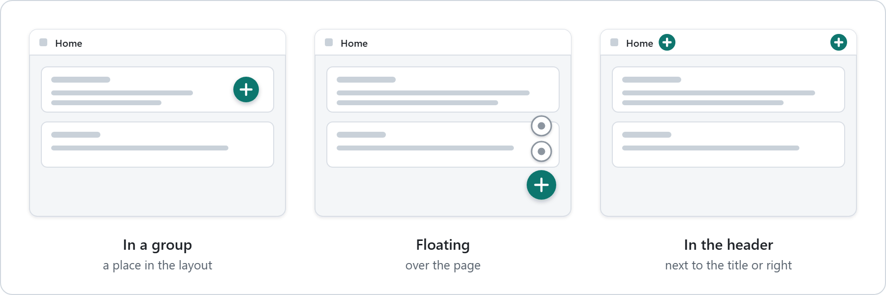
The editor asks two questions: Show and On.
| Show | On | Typical use |
|---|---|---|
| In a group's layout | the group's page | A button among other widgets. Its size is picked on the grid, like any widget. |
| Floating over the page | one, selected or all pages | The classic action button in a corner of the screen. Nine positions, adjustable edge distance. |
| In the header | one, selected or all pages | Next to the page title or on the right of the header, alongside the other header content. The menu opens downwards. |
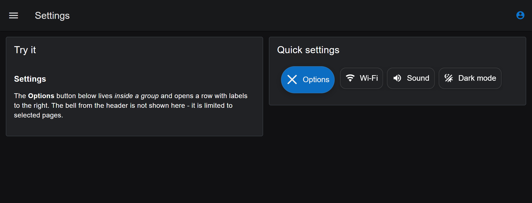
- Selected pages shows the button only on the pages you tick, for example on Home and Lights but not on Settings.
- In the header, a small transparent button fits best. The editor offers this with one click.
- If the header is hidden in the Dashboard settings, a header button floats in the matching top corner instead.
Styles
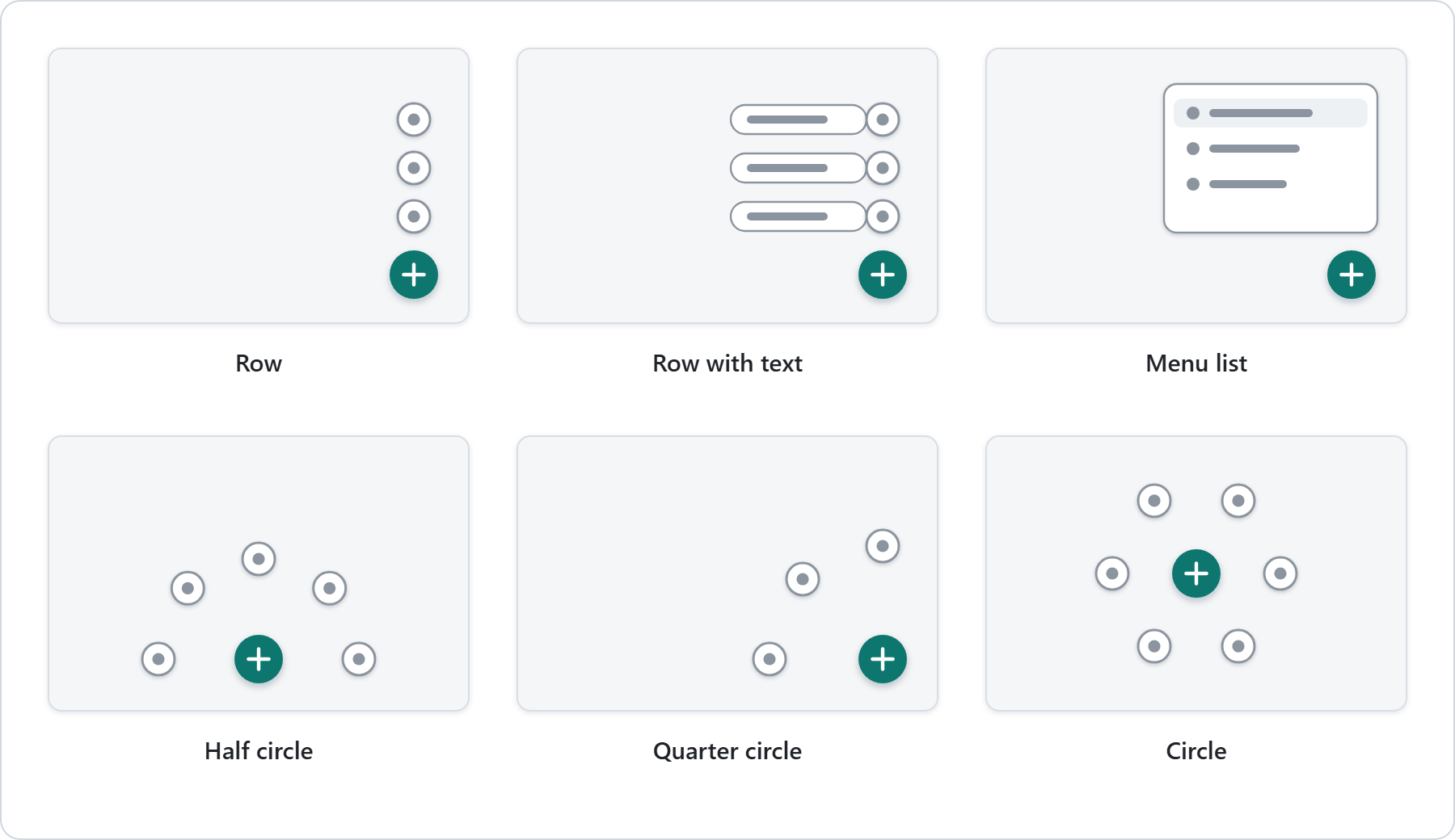
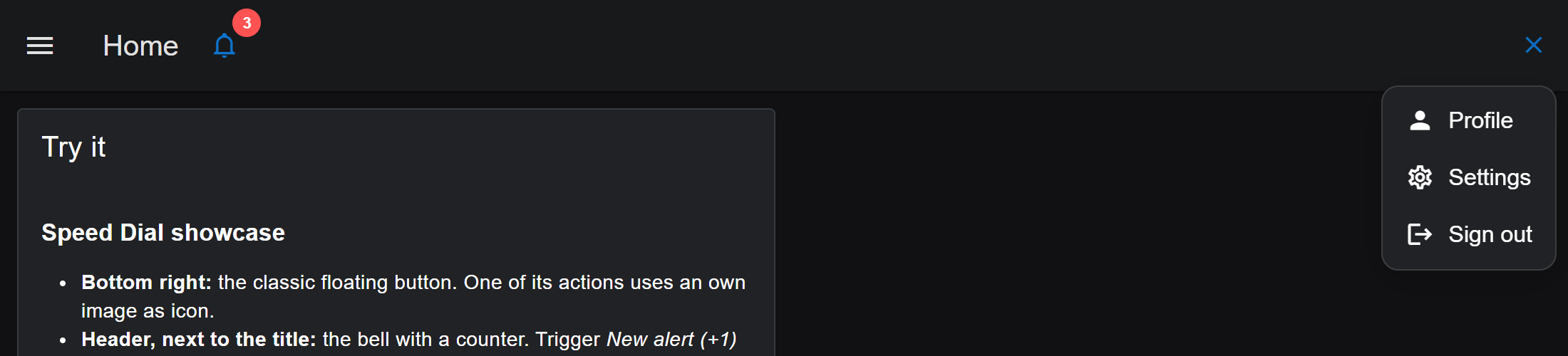
| Style | What it looks like | Good for |
|---|---|---|
| Row | Round icon buttons in a line | Few actions with clear icons |
| Row with text | Separate buttons with icon and label | Actions that need a word to be clear |
| Menu list | One panel with labelled rows, like a dropdown menu | Longer lists, settings, account menus |
| Half circle | Icon buttons on an arc around the button | Buttons at an edge or in the center |
| Quarter circle | Icon buttons on a quarter arc | Buttons in a corner |
| Circle | Icon buttons all around the button | Buttons in the middle of the screen |
The opening direction is chosen automatically, away from the nearest screen edge. You can also set it yourself. A row that does not fit turns to the side with the most room.
The editor
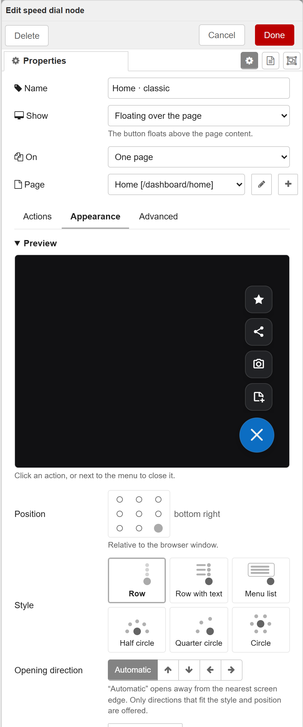
The configuration dialog has three tabs. Every field is also explained in the node help (book icon in the Node-RED sidebar).
Actions
The list of menu entries. Drag to reorder, duplicate with the copy button.
| Field | Meaning |
|---|---|
| Icon | Picked from the icon picker (see Icons) |
| Label | Text of the action. Shown next to the icon or as a tooltip, depending on the style |
| Payload | Value of msg.payload on click: text, number, true/false or JSON |
| More options: ID | Unique name, sent as msg.action. Created from the label automatically for new actions and stable afterwards |
| More options: Topic, Tooltip | Optional msg.topic and hover text |
| More options: Color, Icon color | Own colors for this action |
| More options: Visible, Enabled | Hidden or disabled actions send nothing |
Appearance
| Field | Meaning |
|---|---|
| Preview | A small dashboard page in your theme colors. Click the button to open the menu with all current settings. Until you add actions, five examples are shown. The preview never sends anything. |
| Position | Click a cell of the 3 × 3 grid. Not used in the header. |
| Style | One of the six styles |
| Opening direction | Arrows, or Automatic. Only directions that fit style and position are offered. |
| Icon, Icon when open | The button icon, and the icon while the menu is open (an X by default, or keep the normal icon) |
| Color | Dashboard color, transparent, twelve suggestions, or any color |
| Size | Small, medium or large |
Advanced
| Group | Settings |
|---|---|
| Main button | Label next to the icon, tooltip, counter badge and its colors, icon and text color, exact size, corner radius, edge distance (one value or side and top/bottom separately), visible, enabled |
| Menu | Circle radius, gap between actions, action size, animation duration, close after selection, dim the page while open |
| Display | Corner radius of the actions, shadow, z-index |
Icons
The icon picker has three tabs:
| Source | Contents | Value |
|---|---|---|
| PrimeIcons | 314 icons, included in the package | pi-… |
| Material Design | More than 7,000 icons, the same set the Dashboard itself uses | mdi-… |
| Own image | An SVG, PNG, WebP, GIF or JPG file – uploaded or linked | image address |
Own images can be
- uploaded – the image is stored directly in the flow (at most 16 KB), no server folder needed, or
- linked by address –
https://…, or a path such as/icons/lamp.svgthat points to the folder set ashttpStaticin Node-RED'ssettings.js.
Own images are tinted in the icon color, exactly like the font icons. Single-color symbols with a transparent background work best, ideally as SVG. A photo would appear as a plain colored shape.
Colors and theme
Without own colors, the speed dial follows your Dashboard theme: the button uses the theme's primary color, the actions use the surface and text color of the groups. When you change the theme, the speed dial changes with it.
Every color field offers:
- Theme color – the first swatch (Dashboard, Default or Automatic)
- Transparent – the checkered swatch. As a background, only the icon remains: no fill, no border, no shadow.
- Twelve suggestions, and the eyedropper swatch for any color
- A hex field for typing a value, including semi-transparent colors such as
#2563eb80
The icon and text color adapts automatically: dark on light colors, white on dark colors.
Counter badge
A small badge at the top right of the button, for example for open alerts or unread messages.
- A number or a short text up to 6 characters, for example
3or! - Empty or
0hides it, numbers above 99 show as99+ - Red by default (the error color of the theme), with its own colors if you like
You can set a starting value under Advanced, but usually the flow keeps it up to date:
msg.payload = { button: { badge: 3 } };
return msg;
Control from a flow
Messages on the input change the speed dial at runtime. They produce no output. Changes made by messages last until the next deploy or restart of Node-RED.
| Goal | Message |
|---|---|
| Replace all actions | msg.payload = [ {…}, {…} ] |
| Change appearance or behavior | msg.payload = { button: {…}, menu: {…}, theme: {…} } |
| Both in one message | msg.payload = { actions: [ … ], button: {…} } |
| Change single actions | msg.command = "patch", msg.payload = [ { id: "…", … } ] |
| Remove actions | msg.command = "remove", msg.payload = [ "id", … ] |
| Back to the editor settings | msg.command = "reset" |
| Only for one browser | add msg._client to any of the above |
// Replace all actions – only id and payload are required
msg.payload = [
    { id: "on",  label: "On",  icon: "mdi-lightbulb-on",  payload: true },
    { id: "off", label: "Off", icon: "mdi-lightbulb-off", payload: false }
];

// Change only some settings – everything else stays as it is
msg.payload = { button: { icon: "mdi-bell", badge: 2 }, menu: { shape: "semi-circle", direction: "auto" } };

// Change single actions
msg.command = "patch";
msg.payload = [{ id: "off", label: "Turn off", enabled: false }];

// Remove actions
msg.command = "remove";
msg.payload = ["off"];

// Back to the settings from the editor
msg.command = "reset";
Change it for one browser only
Without msg._client, a change applies to every browser. With it, the change applies to one browser tab (socketId) or to all tabs of one browser (clientId). This works with every message above, including patch, remove and reset.
Two Dashboard settings are needed, both in the Client Data section of the Dashboard settings:
- Accept Client Data – enable
ui-speed-dial, otherwise messages with_clientare rejected. - Include Client Data – lets a click deliver
msg._client, so the flow knows which browser to answer.
// Answer exactly the browser that just clicked (msg comes from the speed dial output)
return {
    _client: msg._client,
    command: "patch",
    payload: [{ id: msg.action, enabled: false }]
};
The browser must be connected at that moment. A later message without _client discards all per-browser changes. When a browser leaves the page, its change is discarded.
Field reference: action
| Field | Type | Default | Notes |
|---|---|---|---|
id |
string | – | Required. Unique; letters, digits and _ . : -, at most 64 characters. Sent as msg.action |
payload |
any | – | Required. Sent as msg.payload. null is allowed |
label |
string | "Action" |
Plain text, no HTML, at most 160 characters |
icon |
string | "pi-circle" |
See Icons |
tooltip |
string | "" |
Hover text |
topic |
string | – | Sent as msg.topic if set |
background |
string | "" |
Hex color; "" = theme |
color |
string | "" |
Hex color; "" = automatic |
visible |
boolean | true |
Hidden actions are not shown and send nothing |
enabled |
boolean | true |
Disabled actions are shown greyed out and send nothing |
Field reference: button
| Field | Type | Default | Notes |
|---|---|---|---|
icon |
string | "pi-plus" |
See Icons; "" for no icon |
closeIcon |
string | "pi-times" |
Icon while the menu is open; "" keeps the normal icon |
label |
string | "" |
Text next to the icon |
tooltip |
string | "Actions" |
Hover text and accessible name |
badge |
number or string | "" |
Counter; "" and 0 hide it, above 99 shows 99+, text up to 6 characters |
badgeBackground |
string | "" |
"" = error color of the theme |
badgeColor |
string | "" |
"" = automatic |
background |
string | "" |
"" = primary color of the theme; "#00000000" = transparent |
color |
string | "" |
"" = automatic |
size |
number | 56 |
11 – 96 px |
radius |
number | 48 |
0 – 48 px; 48 is round |
position |
string | "bottom-right" |
top-left, top-center, top-right, center-left, center, center-right, bottom-left, bottom-center, bottom-right |
offsetX, offsetY |
number | 24 |
Distance to the edge, 0 – 500 px |
visible |
boolean | true |
|
enabled |
boolean | true |
Field reference: menu
| Field | Type | Default | Notes |
|---|---|---|---|
mode |
string | "speed-dial" |
"menu" = menu list style |
shape |
string | "linear" |
linear, semi-circle, quarter-circle, circle |
showLabels |
boolean | false |
Labels next to the icons (row with text) |
direction |
string | "auto" |
auto; rows and half circles up, down, left, right; quarter circles up-left, up-right, down-left, down-right |
gap |
number | 8 |
Gap between actions, 0 – 48 px |
actionSize |
number | 44 |
44 – 80 px |
radius |
number | 0 |
Circle radius, 0 – 500 px; 0 = automatic |
duration |
number | 150 |
Animation, 0 – 1000 ms |
closeOnSelect |
boolean | true |
Close the menu after a click |
overlay |
boolean | false |
Dim the page while the menu is open |
The editor's styles map to these fields: row = { mode: "speed-dial", shape: "linear", showLabels: false }, row with text = the same with showLabels: true, menu list = { mode: "menu" }, circles = shape: "semi-circle", "quarter-circle" or "circle".
Field reference: theme
| Field | Type | Default | Notes |
|---|---|---|---|
mode |
string | "auto" |
auto = Dashboard theme; light or dark = fixed colors. Messages only |
background |
string | "" |
Shared background of all actions. Messages only |
color |
string | "" |
Shared text color of all actions. Messages only |
radius |
number | 12 |
Corner radius of the actions, 0 – 40 px |
shadow |
boolean | true |
|
zIndex |
number | 2000 |
1 – 10000; raise it if other elements cover the button |
Value formats
- Colors:
#rgb,#rrggbbor#rrggbbaa.""= theme color,"#00000000"= transparent. Color names such as"red"are not accepted. - Icons:
"pi-…","mdi-…", an image address ("/icons/lamp.svg","https://…"), an inline image ("data:image/…;base64,…", at most 16 KB), or"".
When a message has no effect
A faulty message is discarded completely – nothing changes – and the debug sidebar shows a warning with the reason. Common causes:
- A typo in a field name, for example
colourinstead ofcolor - Numbers sent as text (
"56"instead of56) or outside the allowed range - Color names instead of hex values; icon names without
pi-ormdi- shapechanged while the previousdirectiondoes not fit – send both, or usedirection: "auto"patchorremovewith an ID that does not exist, or duplicate IDs- An action without
payload(nullis allowed, missing is not) _clientwithout Accept Client Data, or for a browser that is not connected
Output
A click on a visible, enabled action sends one message:
| Property | Type | Contents |
|---|---|---|
msg.payload |
any | The payload of the action |
msg.action |
string | The ID of the action |
msg.topic |
string | The topic of the action, if set |
msg._client |
object | The browser that clicked – only with Include Client Data enabled in the Dashboard |
Examples
Import them in Node-RED with Menu → Import → Examples → @vincentgloss/node-red-dashboard-2-ui-speed-dial.
| Example | What it shows |
|---|---|
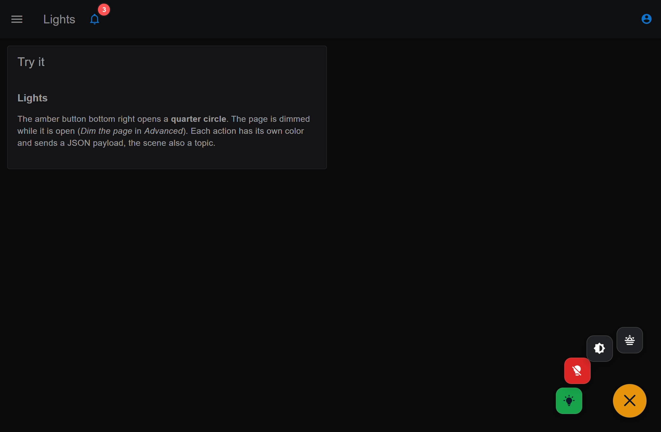
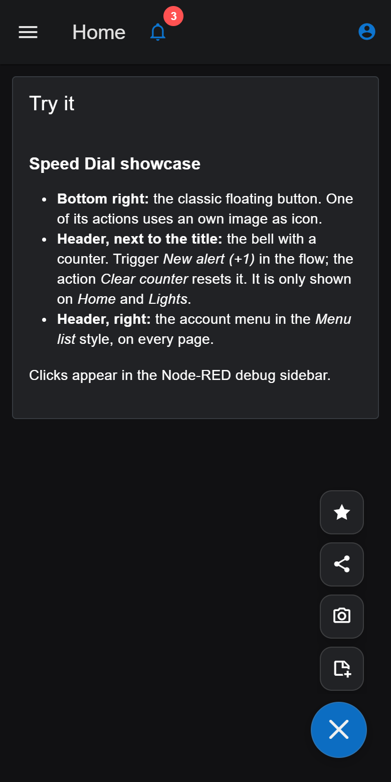
| speed-dial-showcase | Three pages – Home, Lights and Settings – that are added to your Dashboard: an account menu and an alert bell with a live counter in the header, a classic floating button with an own image icon, a quarter circle with colored actions, and a button inside a group. Each page explains what to try. |
| speed-dial-demo | Several speed dials on different pages and in a group, with messages to replace, patch, remove and reset actions, and per-browser targeting |
| speed-dial-input-reference | One ready-made function node for every possible input message, including the counter, icons, transparency and the error cases |
Behavior and accessibility
- The menu closes on Escape and on a click outside it.
- Keyboard: Tab focuses the button, arrow keys, Home and End move through the actions, Enter or Space selects.
- Buttons have accessible names; the counter is part of the button's name.
- With the system setting "reduce motion" there is no animation.
- Labels and tooltips are always shown as plain text, never as HTML.
Troubleshooting
The button does not appear
- Check Show and On: with Selected pages, the button appears only on the ticked pages.
- Check Visible under Advanced – it can also be changed by a message.
- If other elements cover it, raise the z-index under Advanced.
The header button floats in a corner instead
The header is hidden in the Dashboard settings. A header button then floats in the matching top corner. Show the header again to place it there.
The colors do not follow my theme
An own color is set. Pick the first swatch (Dashboard, Default or Automatic) to use the theme color again. If the node was created with an earlier version or comes from an example flow, a notice under Advanced may list stored design values that override the theme, with a button to remove them.
The selected pages are gone after importing a flow
Selected pages stores page IDs. When a flow is imported as a copy, Node-RED gives the pages new IDs. Open the speed dial and tick the pages again.
Development
npm install
npm run build   # builds the dashboard widget into resources/
npm pack        # builds and creates the installable package
Project structure
| Path | Contents |
|---|---|
nodes/ui-speed-dial.js |
Node-RED runtime: registration with the Dashboard, input handling, per-client state |
nodes/ui-speed-dial.html |
Editor: dialog, pickers, preview, validation |
nodes/locales/ |
Editor texts and node help, English and German |
lib/schema.json |
All fields, defaults and limits – used by runtime and editor |
lib/protocol.js |
Validation and the input message protocol |
lib/state.js |
Shared and per-browser state |
ui/ |
Dashboard widget (Vue 3, PrimeVue SpeedDial in unstyled mode) |
scripts/assets.cjs |
Generates the icon lists and copies the editor icon font |
examples/ |
Example flows |
License
MIT. Includes PrimeVue and PrimeIcons, both MIT licensed. Material Design Icons are provided by the installed FlowFuse Dashboard.