@seaspotter/node-red-dashboard-2-ui-shutter 0.3.1
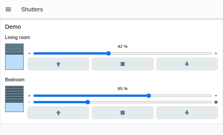
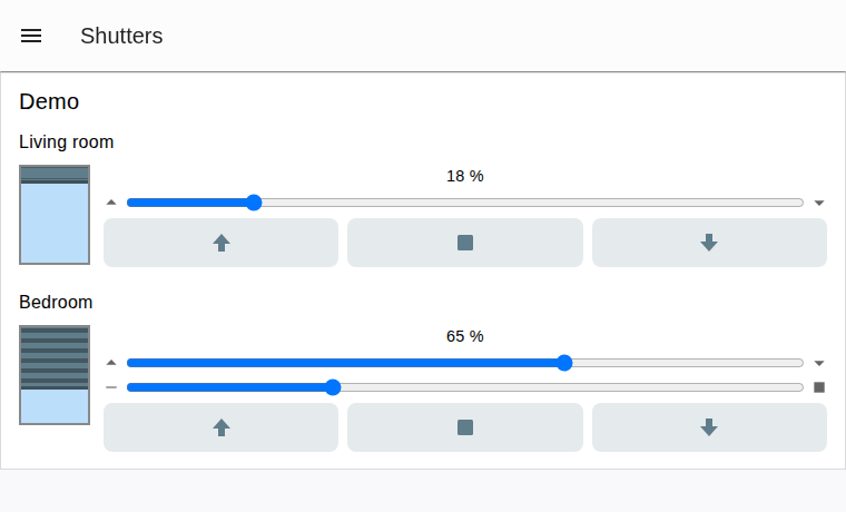
A Node-RED Dashboard 2.0 widget for controlling shutters and venetian blinds: up/stop/down buttons, position and slat sliders, and an animated window graphic.
@seaspotter/node-red-dashboard-2-ui-shutter
A single third-party Node-RED Dashboard 2.0 widget for controlling a shutter or venetian blind: up/stop/down buttons, a position slider, an optional slat slider, and an animated window graphic - all in one node, wiring straight into KNX (or any other) nodes without template/function/switch nodes in between.
Built against the Dashboard 2.0 third-party widget guide:
like every external widget, it extends the core ui-template node and ships its own HTML/CSS/JS bundle
(see Development).
Install
Via the Node-RED editor's Palette Manager (menu -> Manage palette -> Install), search for
@seaspotter/node-red-dashboard-2-ui-shutter.
Or from the command line, from your Node-RED user directory (usually ~/.node-red):
npm install @seaspotter/node-red-dashboard-2-ui-shutter
then restart Node-RED. Requires Node-RED >= 3 and @flowfuse/node-red-dashboard >= 1.30.
To install from a local clone instead (e.g. to try an unreleased change), use
npm install /path/to/node-red-dashboard-2-ui-shutter in place of the registry install above.
Node configuration
| Field | Default | Notes |
|---|---|---|
name |
"" | Node name shown in the flow editor |
group / order / width / height |
- | Standard Dashboard placement fields |
label |
"" | Shown above the controls |
shutterType |
shutter |
shutter or blind. blind adds the slat slider and output 4 |
zeroMeans |
open |
open (KNX default: 0 % = open, 100 % = closed) or closed (inverted). Only affects the graphic and open/closed texts - values on inputs/outputs are never converted |
showGraphic |
true |
Show the animated window graphic |
showButtons |
true |
Show the up/stop/down buttons |
showSlider |
true |
Show the position (and slat) slider(s) |
showPositionText |
true |
Show "73 %" / "Open" / "Closed" text |
textOpen / textClosed |
"Open" / "Closed" | Fully editable, e.g. for German "Offen" / "Geschlossen" |
color |
#607d8b |
Cover/slat color |
skyColor |
#bbdefb |
Window background color |
positionProperty |
payload |
Input msg property read for the position (0-100) |
slatProperty |
slats |
Input msg property read for the slat angle (0-100, blind only) |
upValue / downValue |
false / true (bool) |
Typed (str/num/bool/json). KNX DPT 1.008: 0 = up, 1 = down |
stopValue |
true (bool) |
Typed (str/num/bool/json) |
topic |
"" | Optional topic applied to all output messages |
Messages
Input (one input)
Send a position and/or slat angle (0-100) as separate messages or combined in one:
msg.payload = 42   // position, matches default positionProperty
msg.slats = 70      // slat angle, matches default slatProperty (blind only)
Status telegrams usually arrive separately (e.g. from a KNX status group address) - the node merges
whatever it receives into its own stored state { position, slats }. Out-of-range numbers are clamped
to 0-100; non-numeric values are ignored with a node warning. The node does not pass input messages
through - its outputs only ever carry commands (see below).
Outputs
| # | Meaning | Payload | Extra props | Shutter | Blind |
|---|---|---|---|---|---|
| 1 | Move up/down | upValue or downValue |
msg.action = 'up' | 'down' |
X | X |
| 2 | Stop | stopValue |
msg.action = 'stop' |
X | X |
| 3 | Set position | number 0-100 | msg.action = 'position' |
X | X |
| 4 | Set slats | number 0-100 | msg.action = 'slats' |
X |
msg.topic is set on every output when topic is configured. Each user action (button press, or slider
release) emits exactly one message, on exactly one output.
Example wiring (knxUltimate)
[ui-shutter] output 1 (up/down) --> knxUltimate "Auf/Ab"        (DPT 1.008)
[ui-shutter] output 2 (stop)    --> knxUltimate "Stop"
[ui-shutter] output 3 (position)--> knxUltimate "Position"      (DPT 5.001)
knxUltimate "Position status"   --> [ui-shutter] input
For blinds, wire a second status group address (slat position) through a change node setting
msg.slats before it reaches the widget's input, since Dashboard widgets only have one input.
Development
npm install
npm run build        # one-off Vite build to resources/
npm run dev          # rebuild on change
The built UMD/ESM bundles in resources/ are committed to the repo so the package works for consumers
without a build step after install.
Example
examples/example-flow.json is a self-contained flow - a shutter and a blind,
each wired to inject/function nodes that fake a KNX round-trip (command in, status echoed back a second
later) so you can see the widget move without any real hardware. Import it via the editor's
Import dialog (hamburger menu -> Import, or Ctrl+I), deploy, and open the dashboard.
Screenshots
Release process
Releases are handled by Release Please based on Conventional Commits PR titles:
Prepare releaseworkflow runs on every push tomain. It reads commit history since the last release, maintains a standing "release PR" with the version bump and changelog, and keeps it up to date as more PRs land.- Merging that release PR creates the
vX.Y.Ztag and the GitHub Release, which (in the same workflow run, as a follow-up job gated on release-please'srelease_createdoutput) builds the package, publishes it to the public npm registry, then triggers a refresh on the Node-RED Flow Library catalogue entry. This runs as a job in the same workflow rather than a separate tag-triggered one, because a tag created via the defaultGITHUB_TOKENdoesn't trigger other workflows. Lint Pull Request Titleenforces the<type>(<scope>): <subject>format on every PR (feat:-> minor,fix:/perf:-> patch,feat!:/fix!:-> major,docs:/chore:/refactor:-> no release unless paired with a breaking change).
Publish Release still exists as a manual (workflow_dispatch-only) rescue workflow, in case the
automated publish job ever needs to be re-run by hand.
main is protected: every change, including the release PR, goes through a pull request with a passing
build.